
Jan - Jun 2023
Jan - Jun 2023
Jan - Jun 2023
A Pocket with a Cool Feature Called Money Splitter
A Pocket with a Cool Feature Called Money Splitter
A Pocket with a Cool Feature Called Money Splitter
An e-wallet application just like gopay, OVO, Dana. But equipped with pocket feature, enchanced with "Money Splitter.
An e-wallet application just like gopay, OVO, Dana. But equipped with pocket feature, enchanced with "Money Splitter.
An e-wallet application just like gopay, OVO, Dana. But equipped with pocket feature, enchanced with "Money Splitter.
🥈 Ranked 2nd in my class
🥈 Ranked 2nd in my class
🥈 Ranked 2nd in my class
💪 High Score of Satisfaction
💪 High Score of Satisfaction
💪 High Score of Satisfaction
Last competence test in my school 🏫 Responsible to create the wireframe ◻️, style guide 🎨, and design system 🌳
Introduction 👀
Before ascension to Grade 12 and get intern, we should pass the competence test in 6 months (1 Semester). My class divided to 5 team, each team have 2-3 student and get randomly app category that includes LMS learning, travel , and e-wallet 💰.

Here’s The Problem
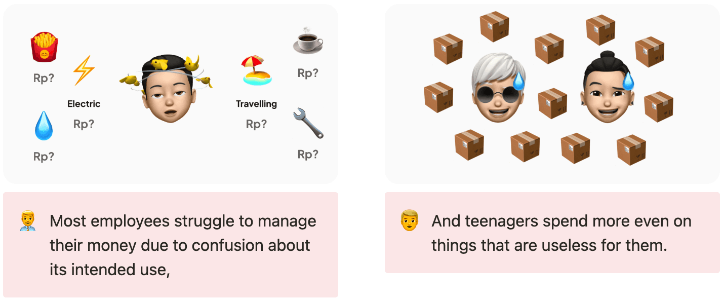
With the convenience of digital transactions, there’s 2 types problems that we found:
Solution
From the many ideas we receive, we decide to choose the most relevant feature. It's called:
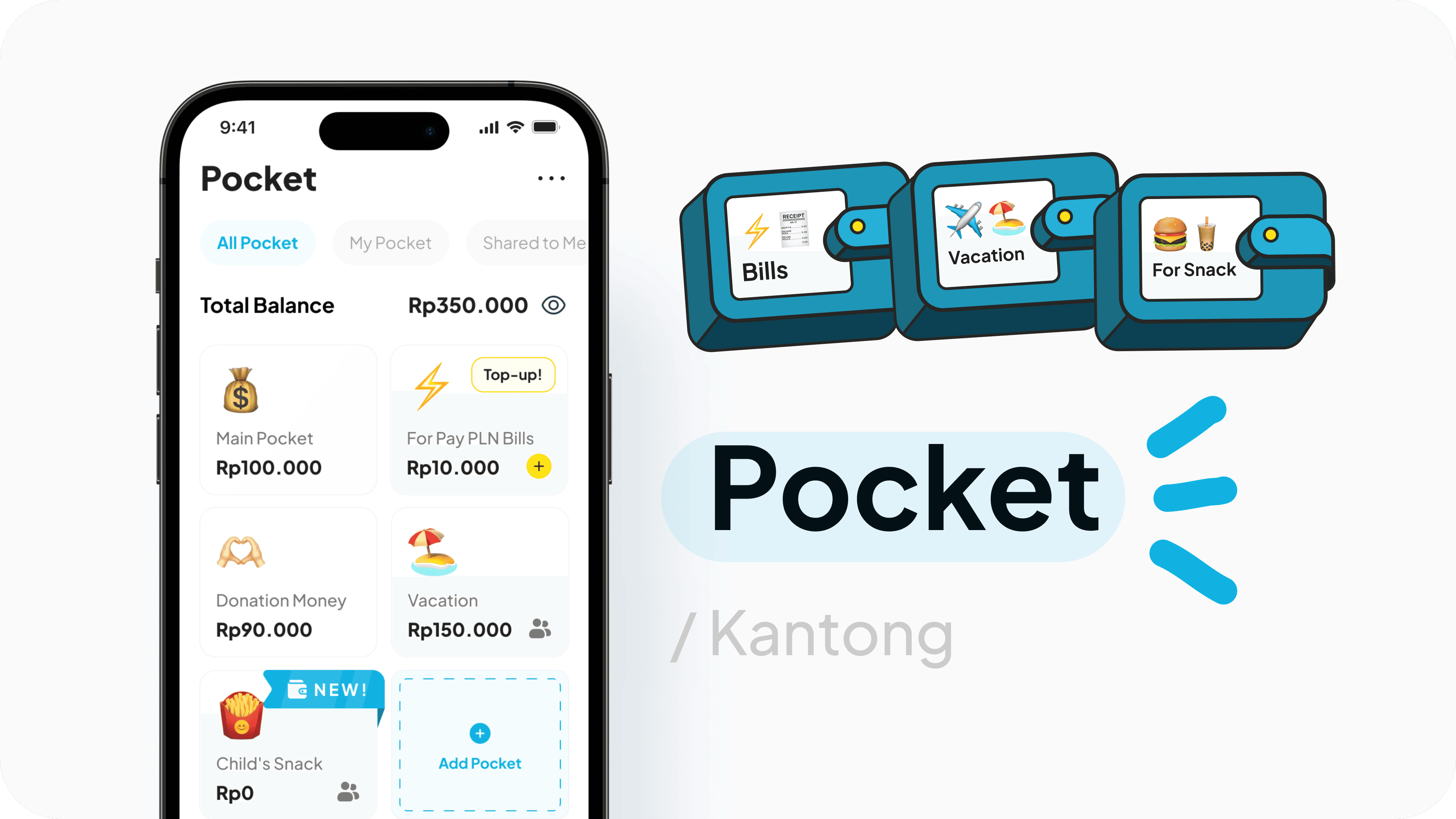
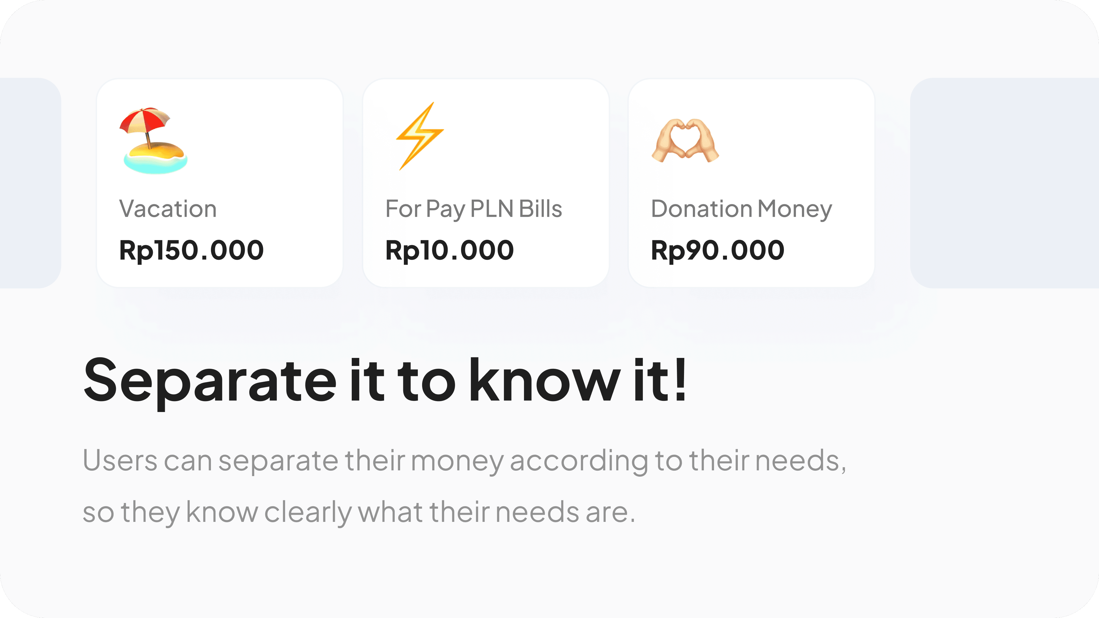
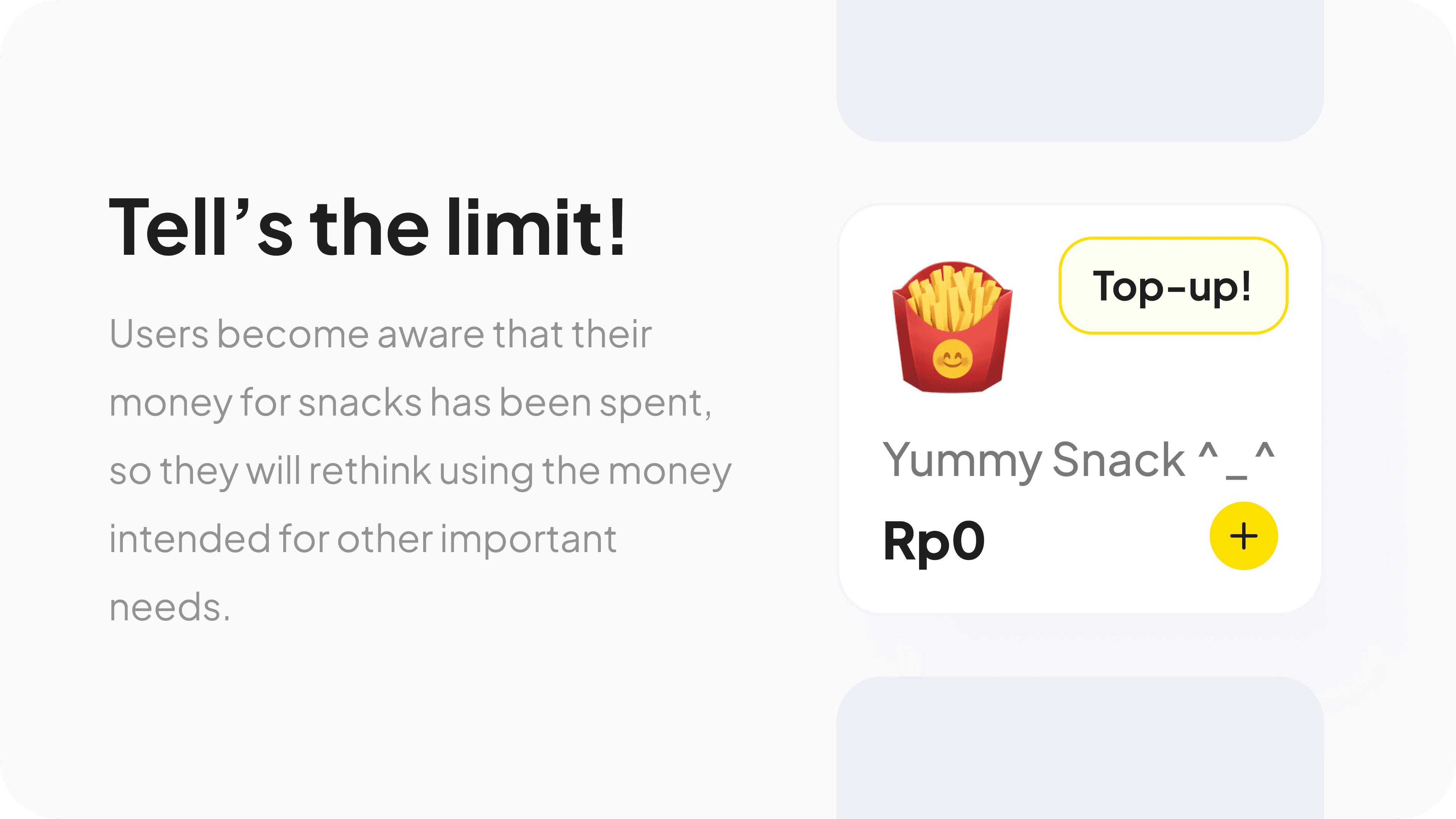
Why: Usually, many teenagers, when their money allowance for snacks is gone, they will use money that is actually meant for their other needs, and they think, “just a little bit, it doesn't matter hehe.” Then, without realizing it, they end up spending a lot.
Sounds familiar with pocket?
Yes, this feature is not something new. In my country, Jago Bank also provides this feature.
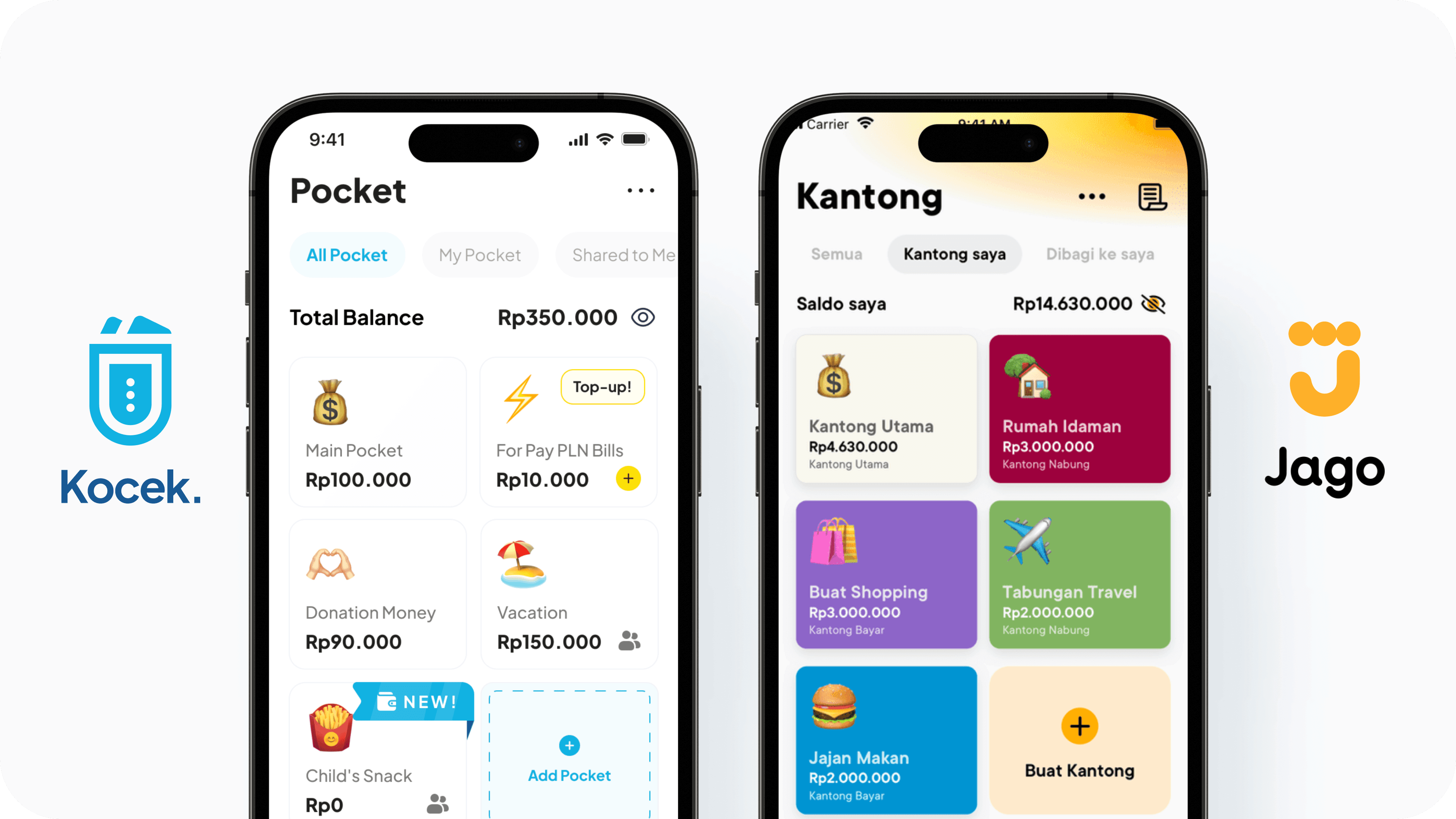
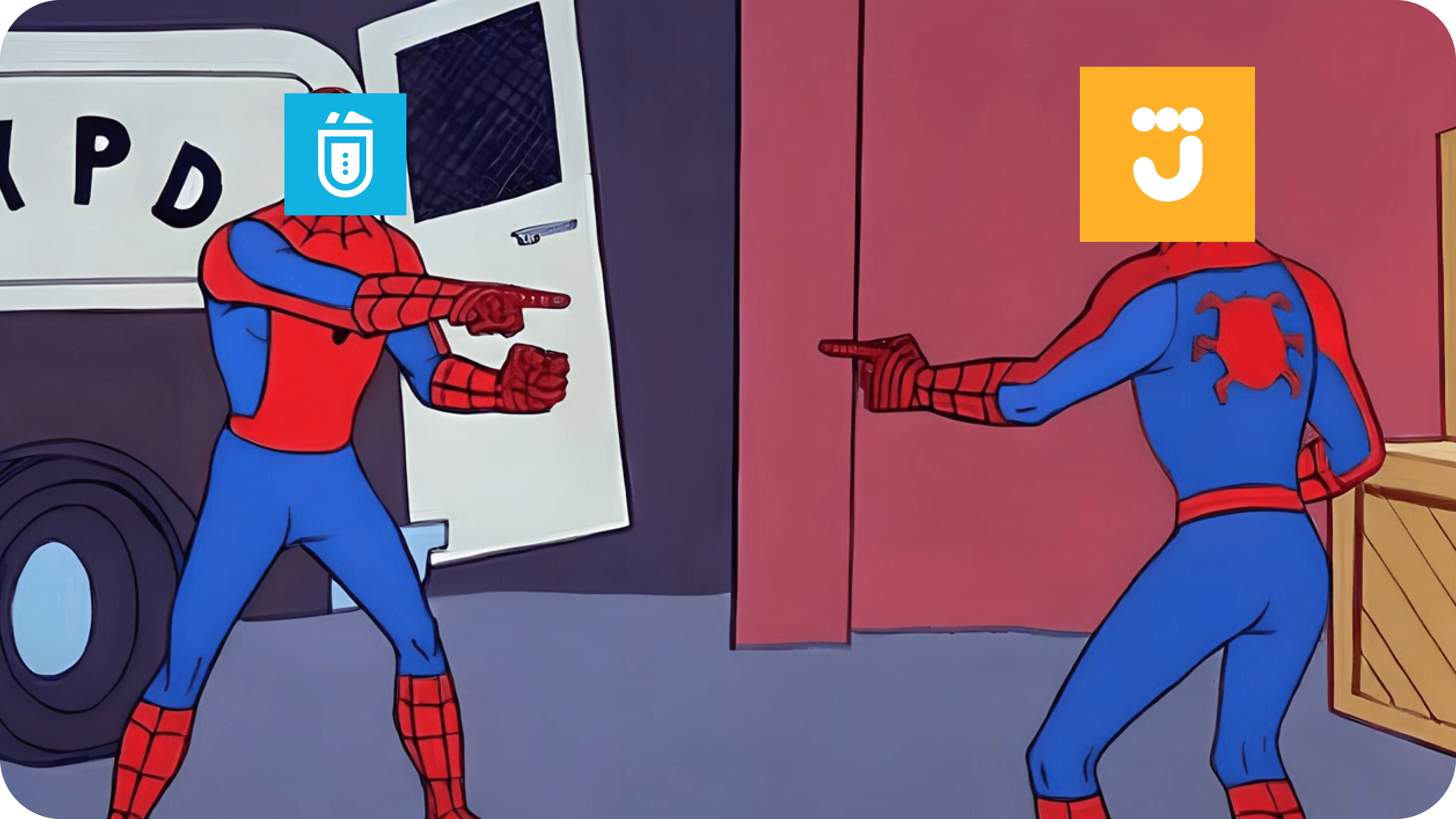
So how we make it more efficient & different? 🤔
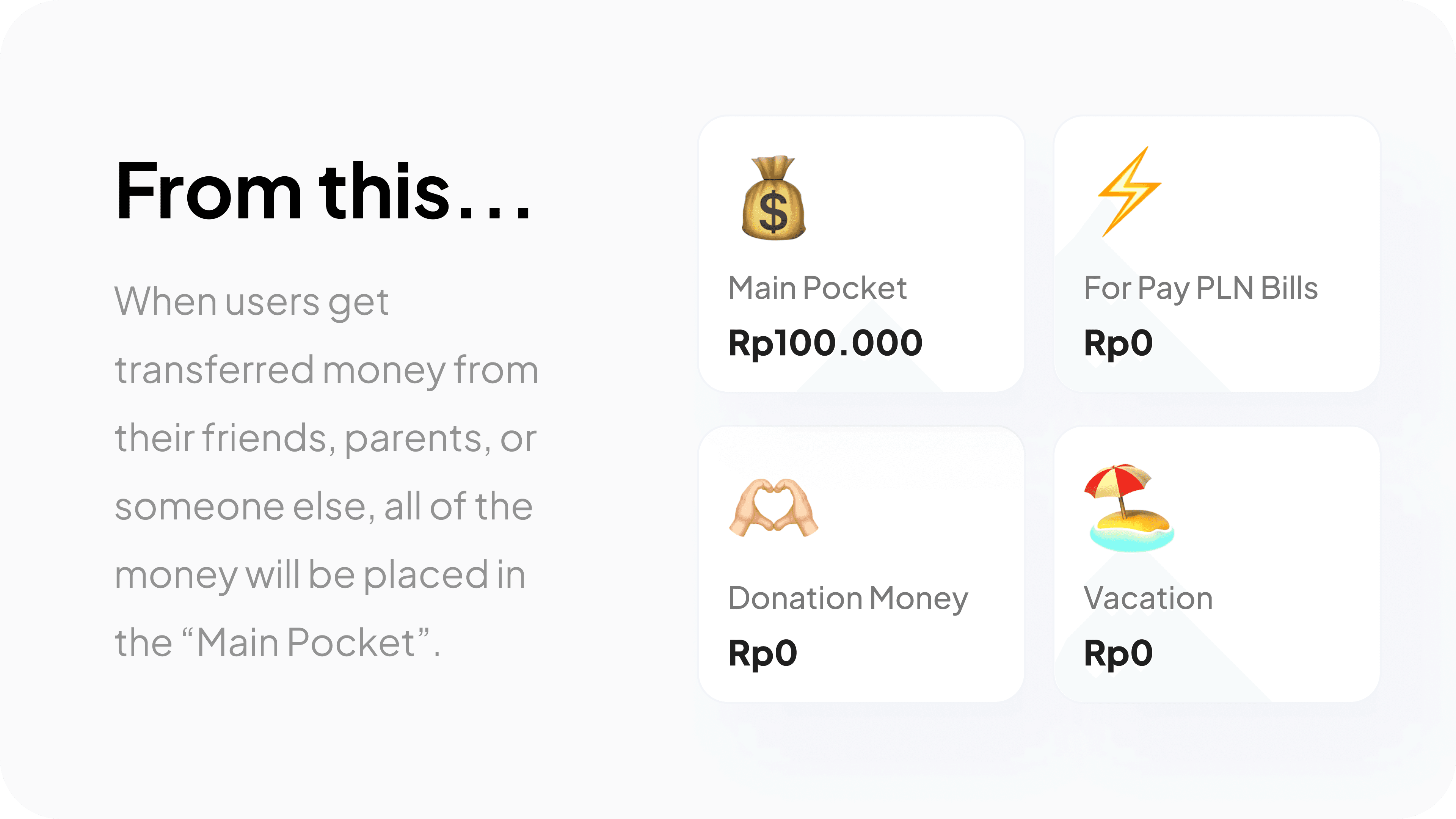
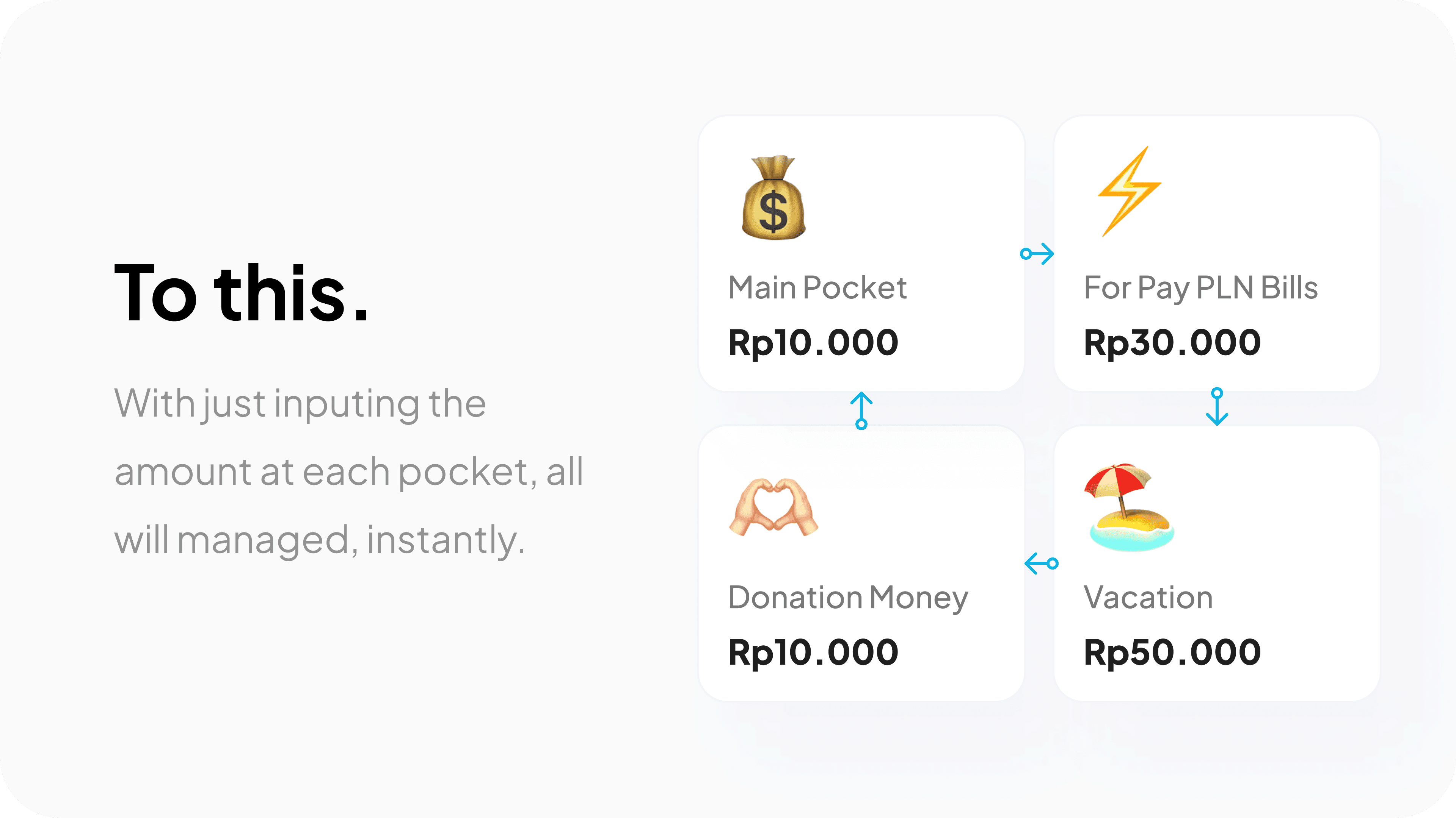
Well, it will be easy to move our money from pocket to pocket, but what if we have five pockets? It will take a lot of time. That's why we added this feature:
Process
After understanding our user's target needs, we started creating wireframes and high-fidelity designs. Our design scored 82.0 on the System Usability Scale (SUS) and 90% on the Single Ease Question (SEQ) after validation.
Wireframes ⬜️
This is our first concept for the transfer flow:
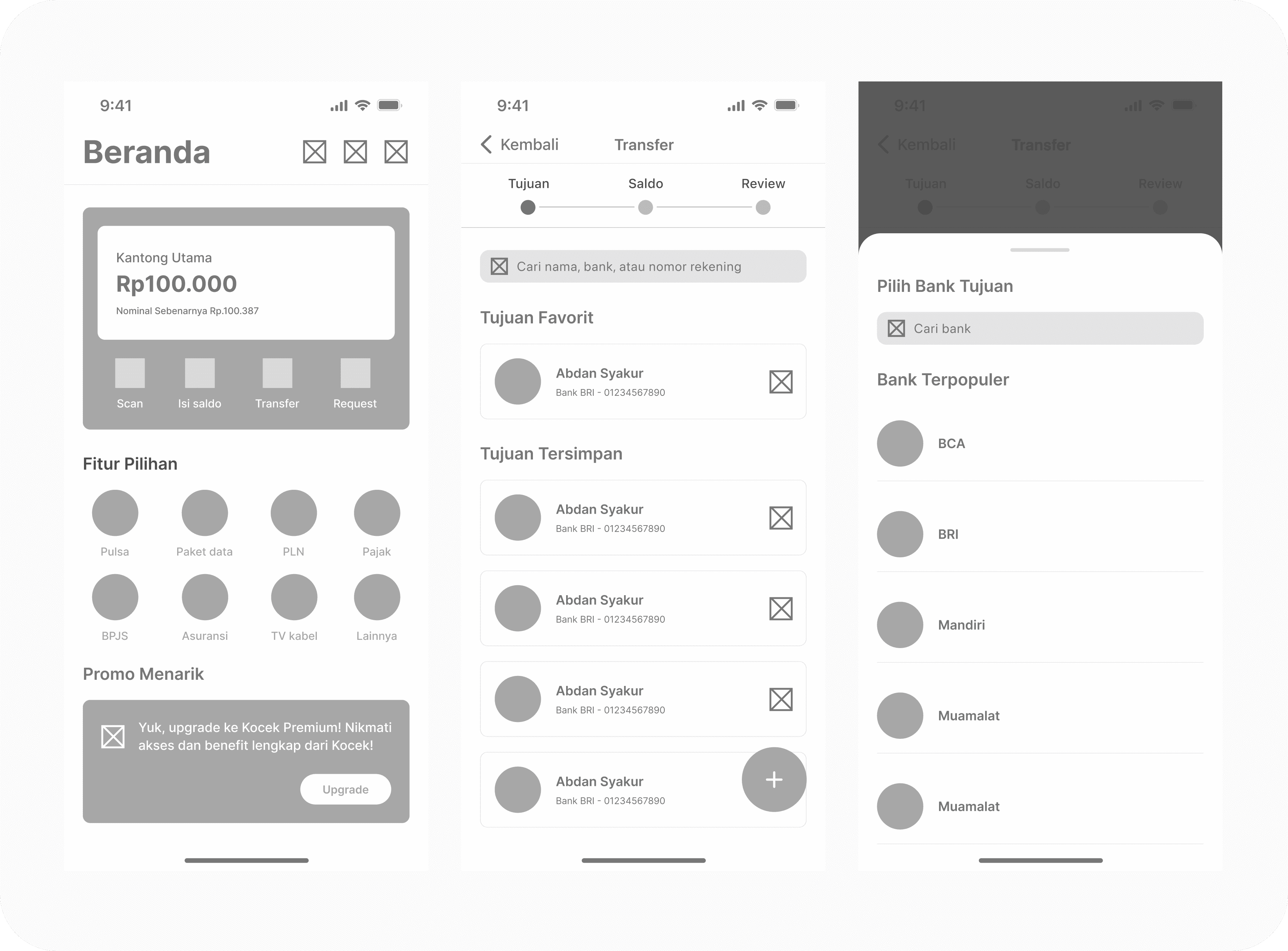
From right to the left: Home, Choose recipient, Add new recipient.
We feel there is too much information on the screen, which could confuse the user. Therefore, we have decided to make changes in the final design.
Design Iteration 🔁
We conducted usability testing with 5 respondents, and based on their feedback, we implemented 2 major modifications:
1. Display Pocket & Add “Pay Shortcuts” feature👇
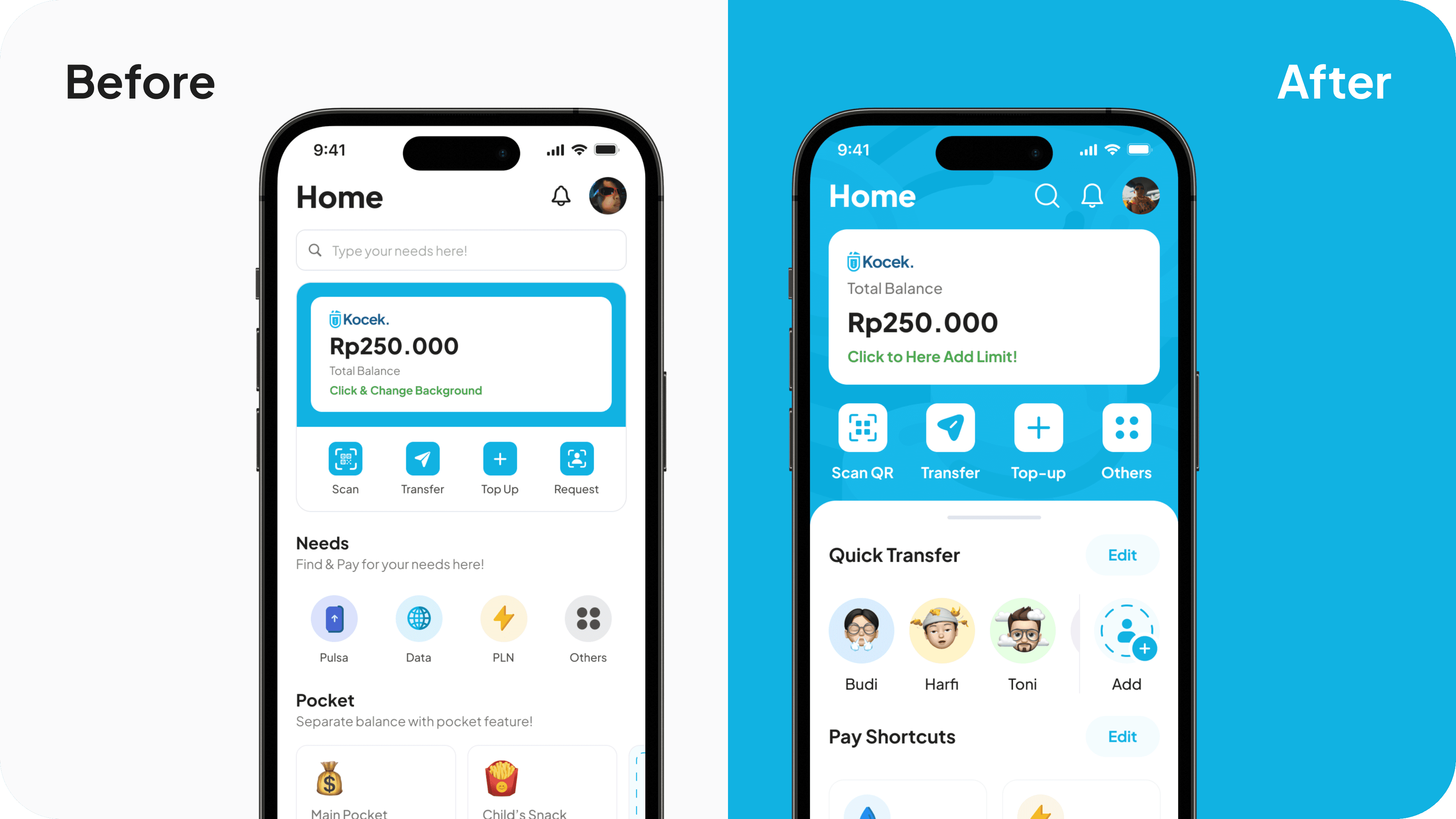
Display pocket is a feature where users can display any pocket they want, but we decide to change it:
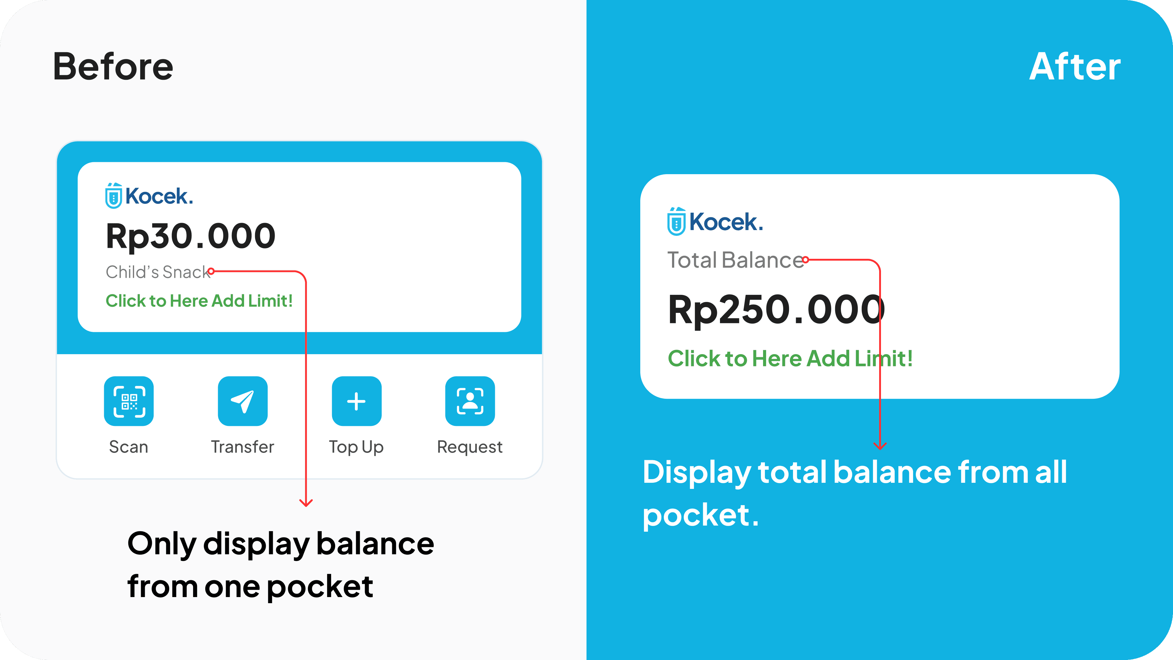
Before: When the user top-up to a pocket that not displayed in there, the lack of display for the increase confuses them.
After: Displayed total balance from all pocket, so when users top-up to any pocket, the balance in the display will increased too.
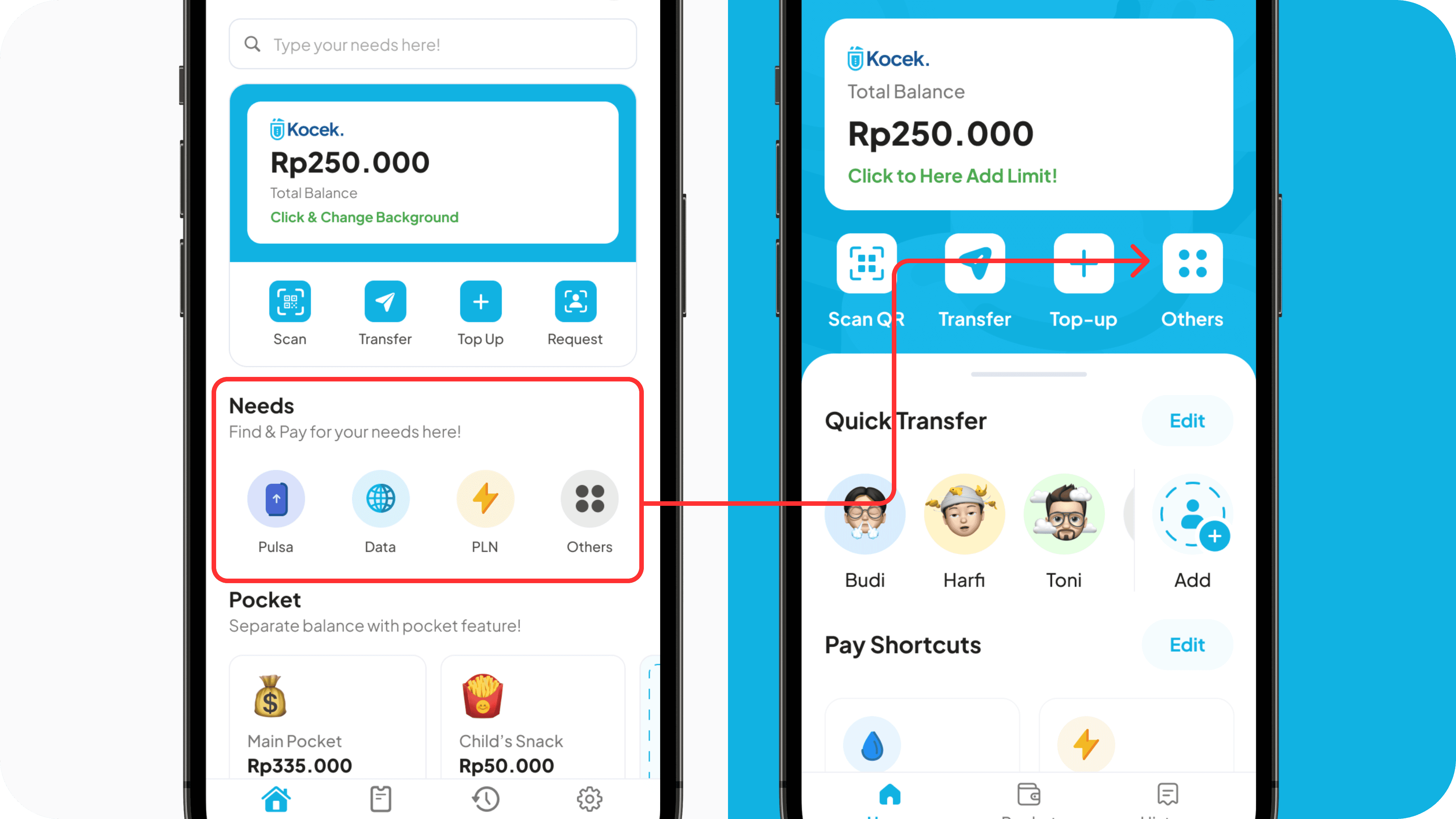
Grouping Needs: We observed users using only 1 to 4 features, so we're adding "Pay Shortcuts". This may increase content on the home screen, but we've grouped the "Needs" section accordingly.
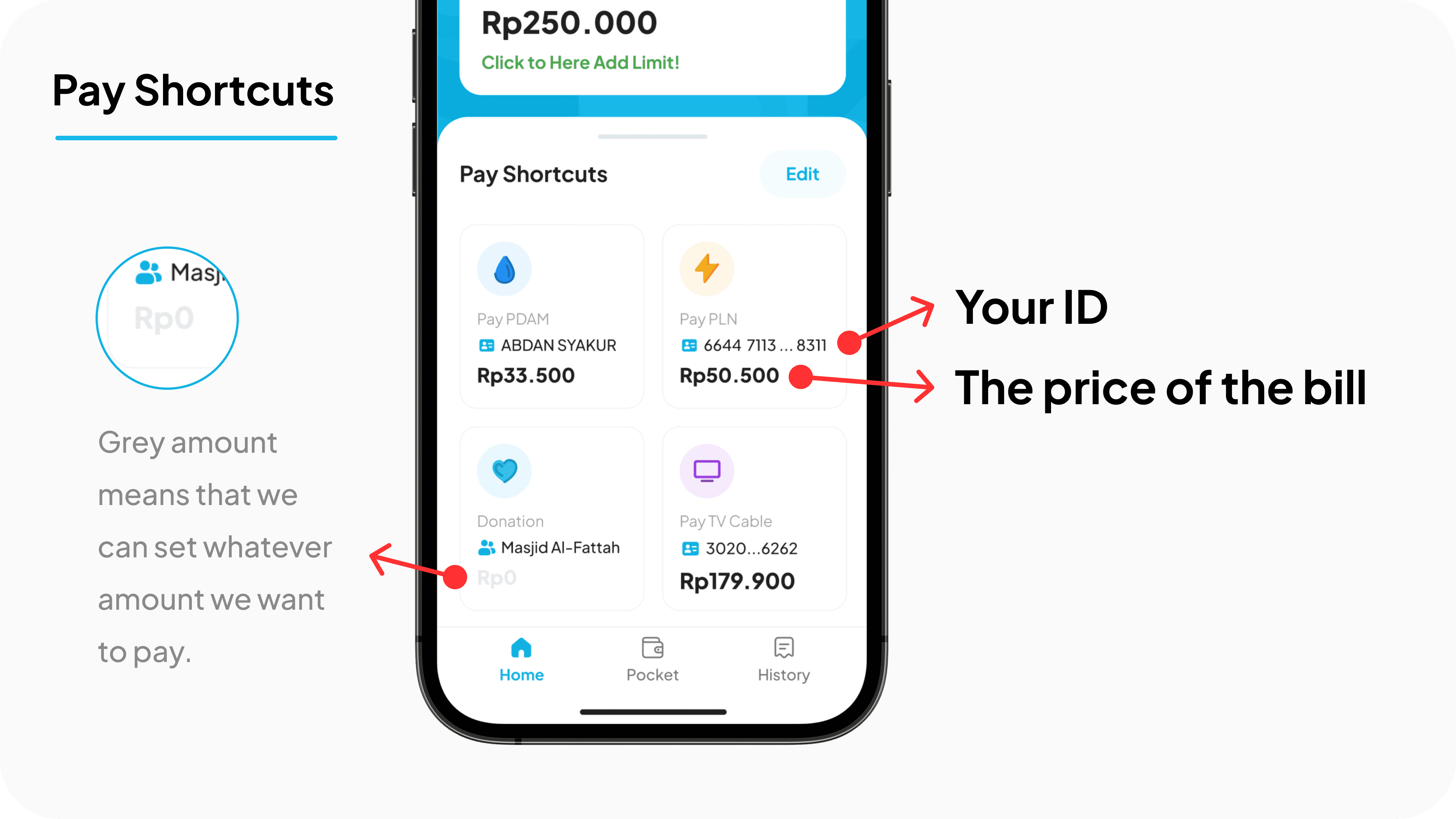
Pay Shortcuts: Users can save their needs and place them on the home screen. This makes the flow shorter and more efficient for paying their bills or needs.
2. Close button👇
Our respondents are confused to close this page, so we have decide to:
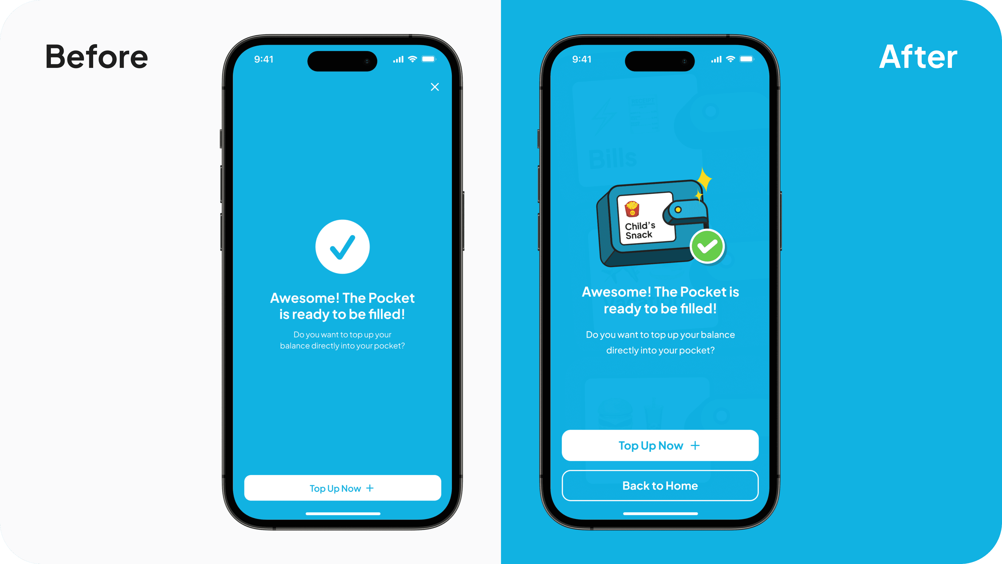
Before: To close the page, click the “X” icon at the top right corner, and the design is not awesome. After: Change the icon into a button and place it at the bottom, making it easier for users to reach.
Final Designs ✨
1. Transfer At Once
Where users can transfer to multiple recipient at once, instantly.
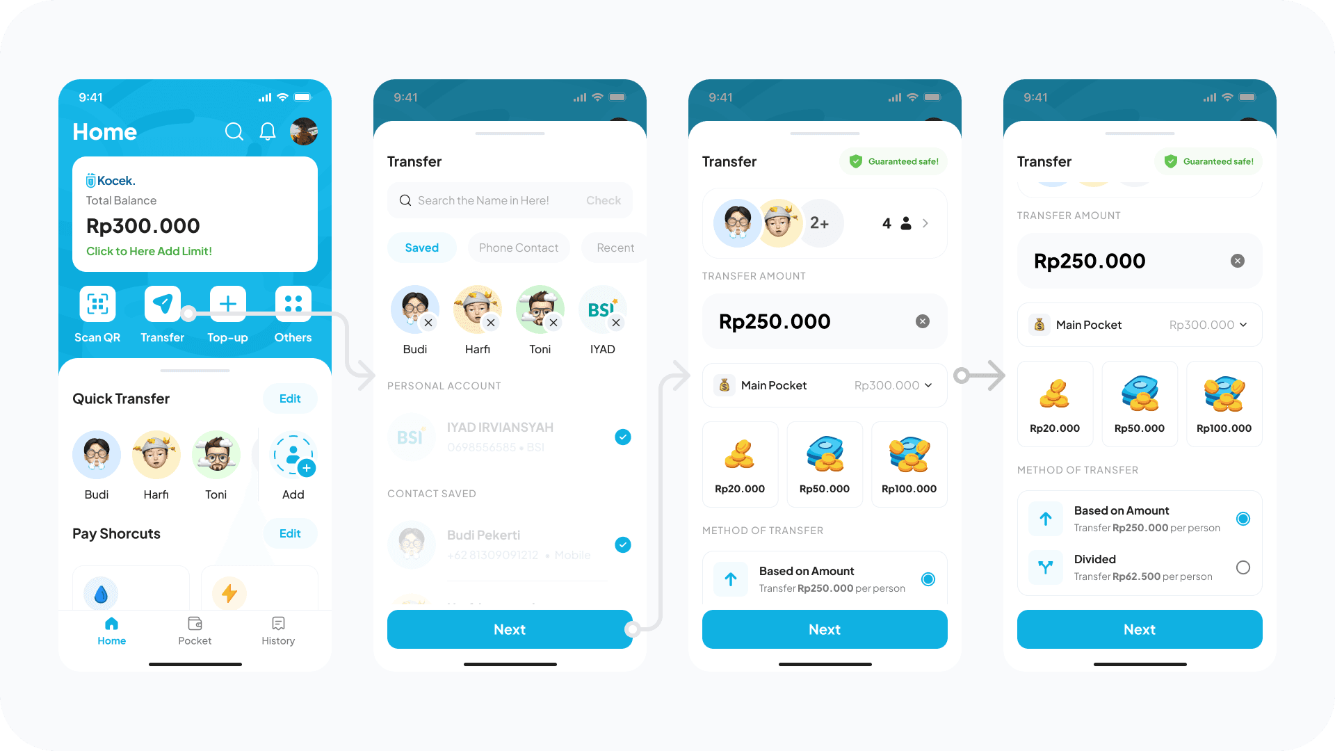
In Order (Right to the left): Home, Select Recipient, Set Amount, Method of Transfer.
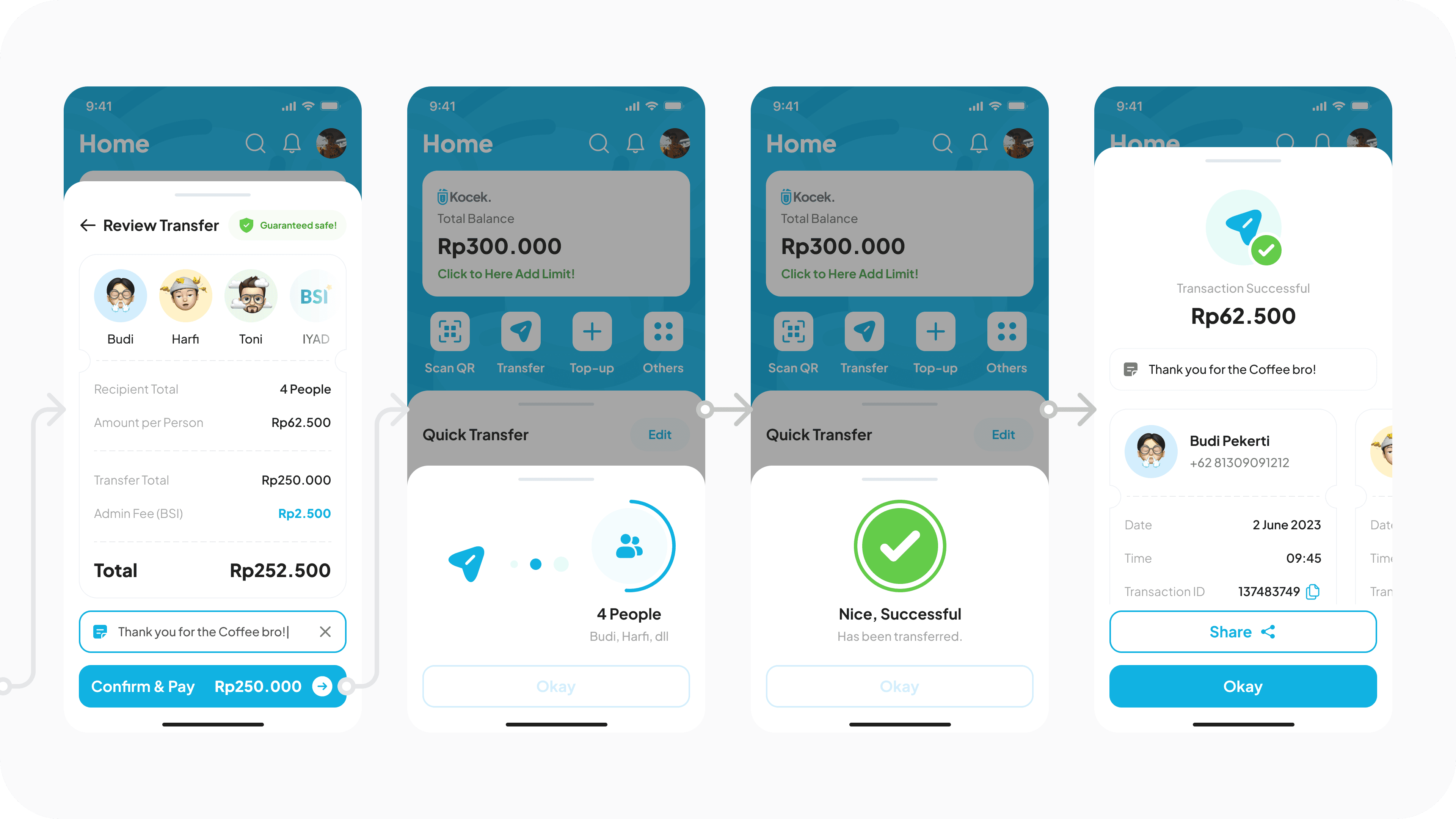
In Order (Right to the left): Review Transfer, Loading Status, Successful Status, Transaction payment proof.
Make sure to watch it on HD quality! Prototype video of "Transfer at Once" flow.
2. Create Pocket
Users can create a pocket that shared to other people.
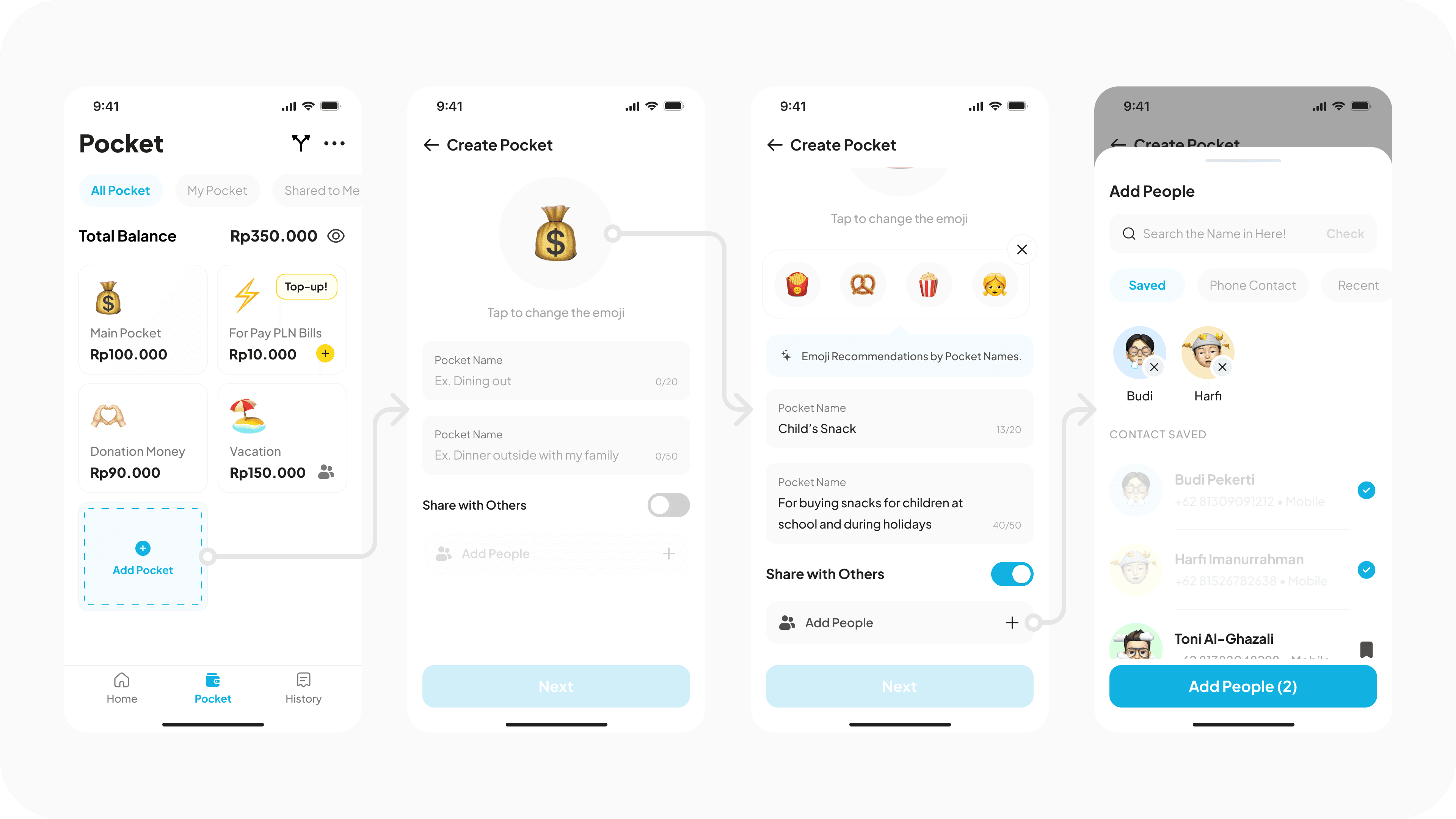
In Order (Right to the left): Pocket page, Create pocket, Add people, Select people.
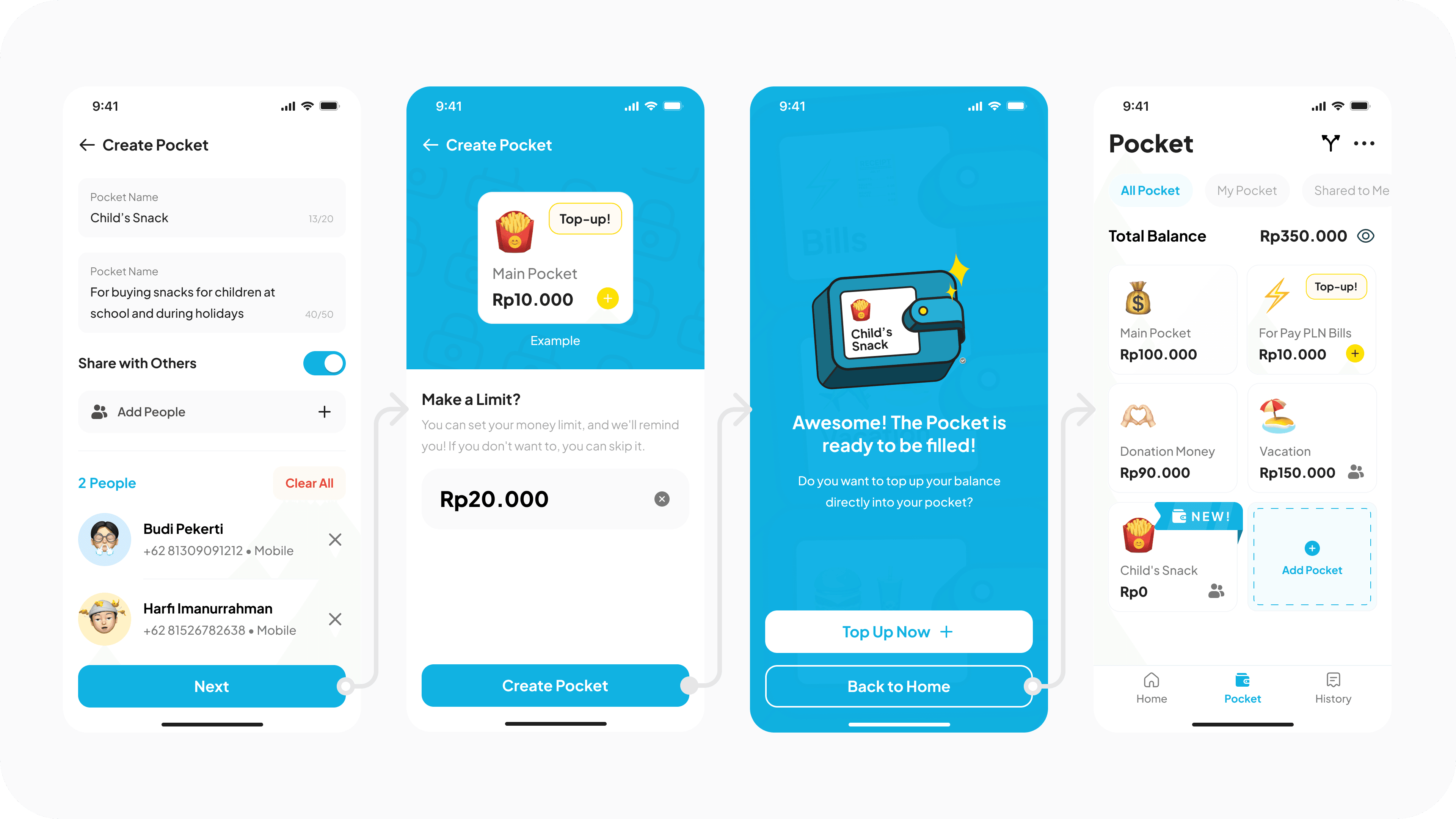
In Order (Right to the left): Create Pocket Page, Set Limit, Succesful Transaction Status, Pocket Page.
Make sure to watch it on HD quality! Prototype video of "Create Pocket" flow.
3. Money Splitter
Users can split their money from the selected pocket.
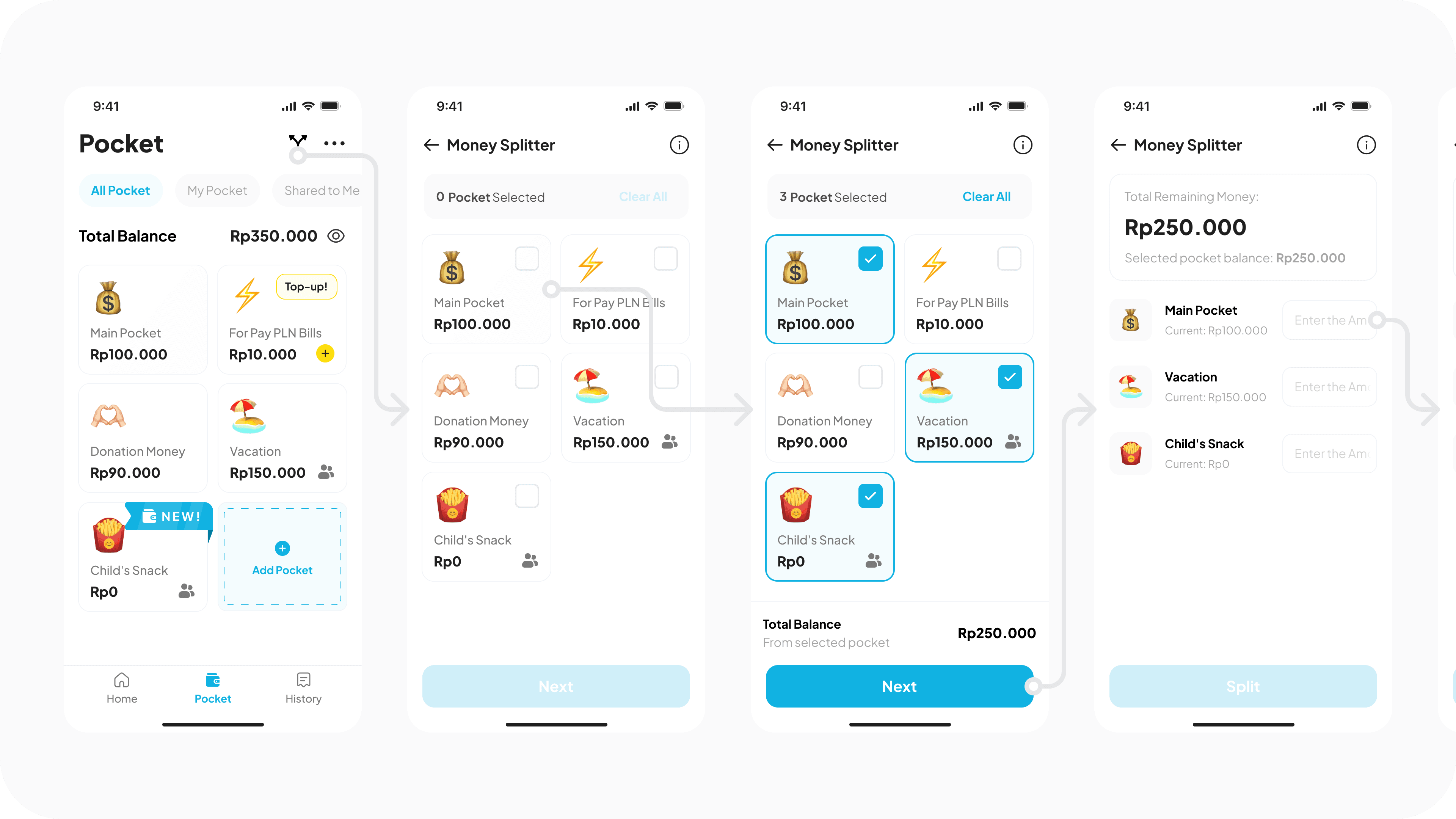
In Order (Right to the left): Pocket Page, Select Pocket, Selected Pocket, Money splitter input.
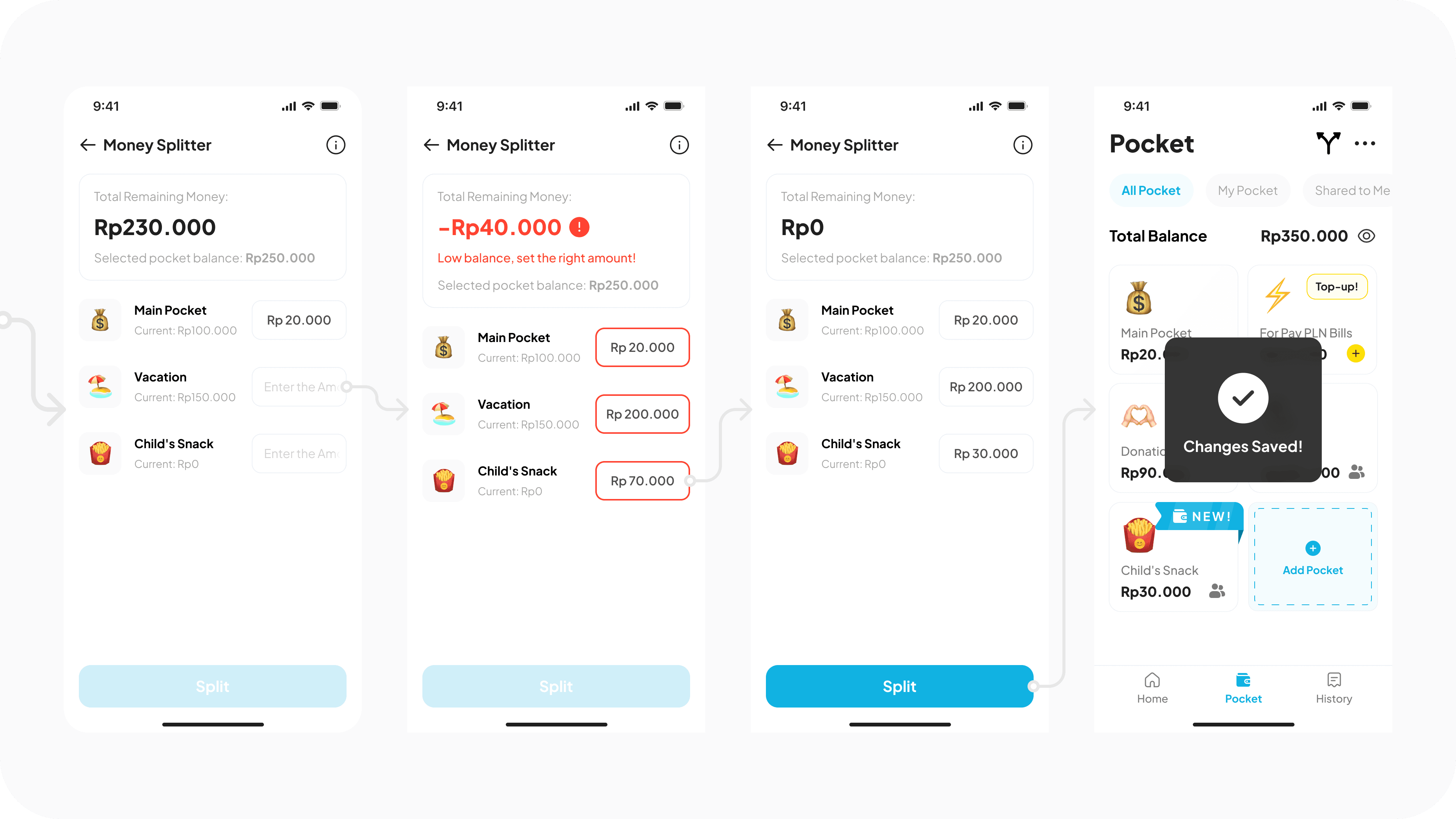
In Order (Right to the left): Money splitter input, Error input, Money splitter input, Successful status.
Make sure to watch it on HD quality! Prototype video of "Money Splitter" flow.
Prototype 📲
You can try it by yourself too, enjoy! 😄 Start Prototype
Documentation 📸:
After design systems is ready, we place it in the frame and edit the content, and not forget to name each layers :)
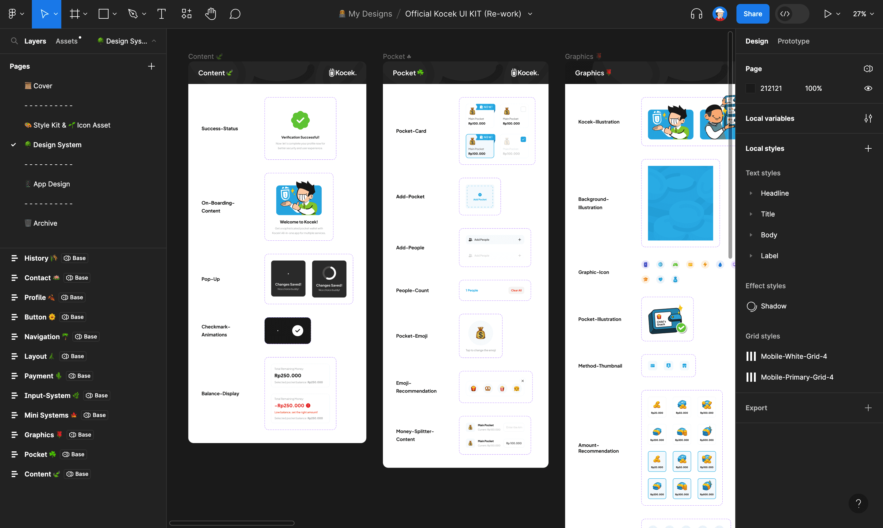
My design systems page.
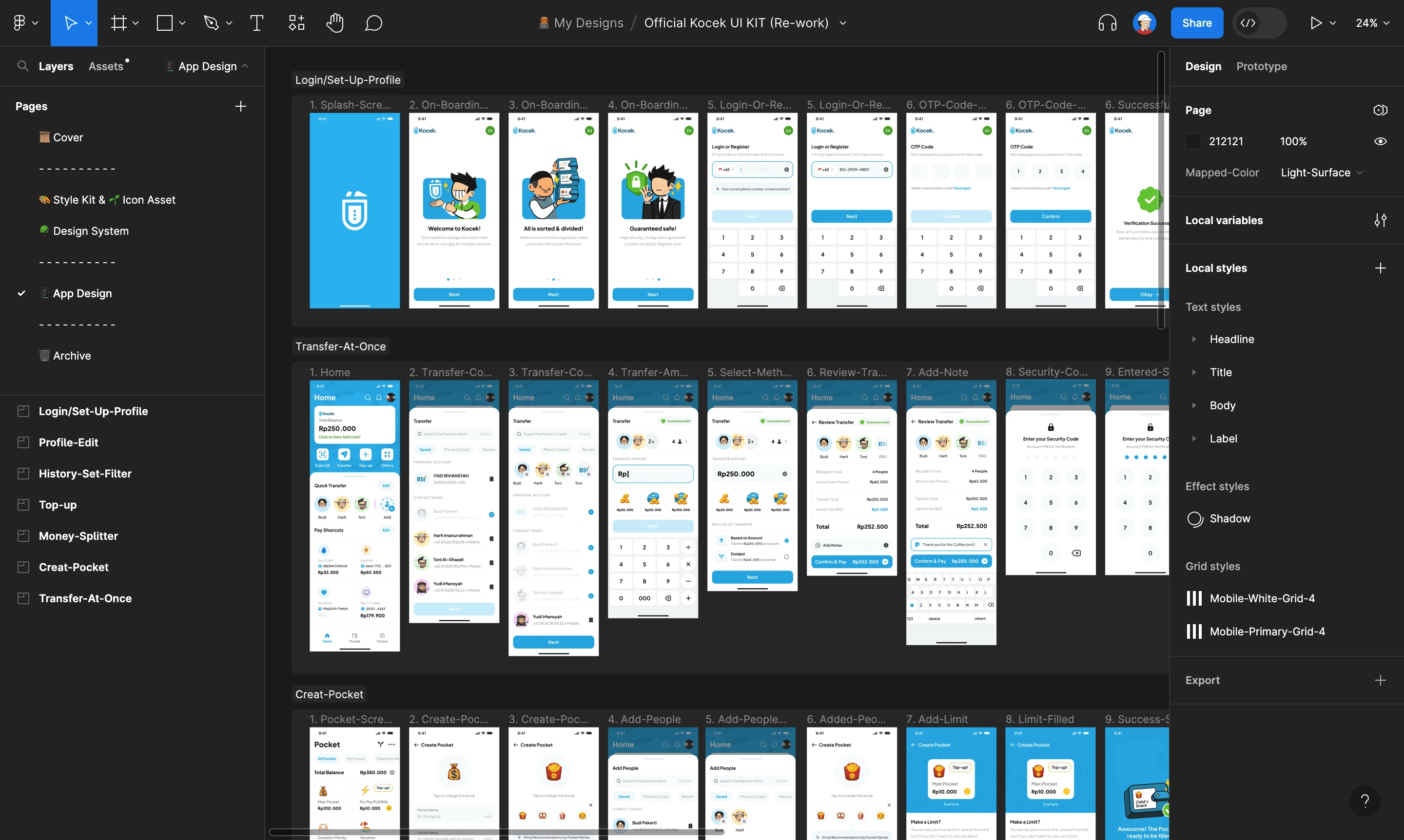
My app design, each flow grouped by a section.
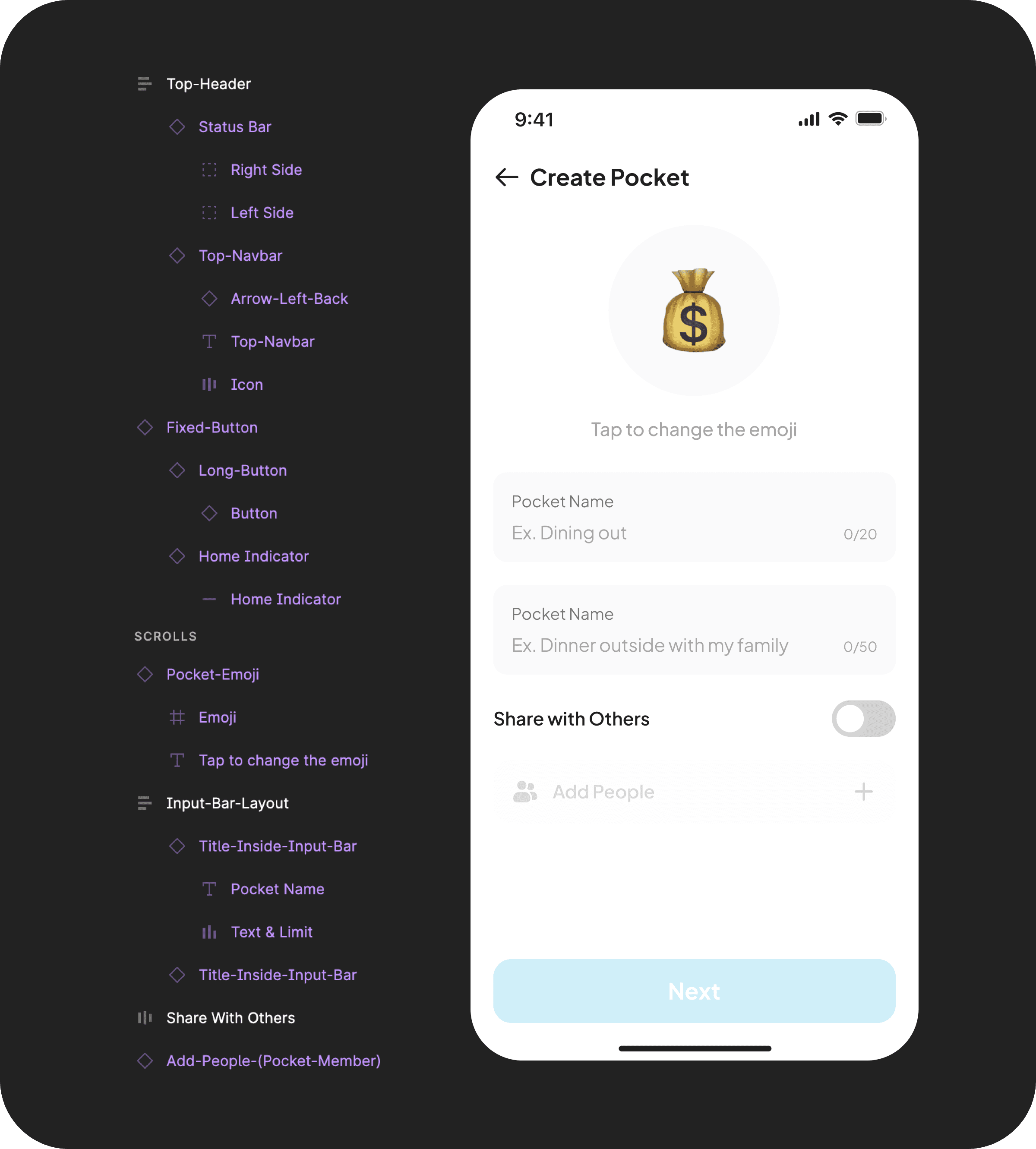
Layer order from top to bottom.
Product Success 🌳
One of our respondents said, "I am very excited and can't wait for this app to become a reality. I will use it!" Alhamdulillah, we received good feedback from our respondents with an excellent score. We also ranked 2nd out of 5 groups with a score of 88 — which is only 2 points behind the first place champion —
What I Learned 🌱
During this project, i learn a lot about to interview someone, designing design systems, color, typography, and validate my design to avoid bias.
🟢 Open for new Opportunities
If you are interested with my work, feel free to contact me. I am excited for collaboration and new opportunities. Thank you!
📨 iyadirviansyah@gmail.com → • 📝 CV/Resume → • 👨💻 LinkedIn →
Last competence test in my school 🏫 Responsible to create the wireframe ◻️, style guide 🎨, and design system 🌳
Introduction 👀
Before ascension to Grade 12 and get intern, we should pass the competence test in 6 months (1 Semester). My class divided to 5 team, each team have 2-3 student and get randomly app category that includes LMS learning, travel , and e-wallet 💰.

Here’s The Problem
With the convenience of digital transactions, there’s 2 types problems that we found:

Solution
From the many ideas we receive, we decide to choose the most relevant feature. It's called:


Why: Usually, many teenagers, when their money allowance for snacks is gone, they will use money that is actually meant for their other needs, and they think, “just a little bit, it doesn't matter hehe.” Then, without realizing it, they end up spending a lot.
Sounds familiar with pocket?
Yes, this feature is not something new. In my country, Jago Bank also provides this feature.


So how we make it more efficient & different? 🤔
Well, it will be easy to move our money from pocket to pocket, but what if we have five pockets? It will take a lot of time. That's why we added this feature:


Process
After understanding our user's target needs, we started creating wireframes and high-fidelity designs. Our design scored 82.0 on the System Usability Scale (SUS) and 90% on the Single Ease Question (SEQ) after validation.
Wireframes ⬜️
This is our first concept for the transfer flow:

From right to the left: Home, Choose recipient, Add new recipient.
We feel there is too much information on the screen, which could confuse the user. Therefore, we have decided to make changes in the final design.
Design Iteration 🔁
We conducted usability testing with 5 respondents, and based on their feedback, we implemented 2 major modifications:
1. Display Pocket & Add “Pay Shortcuts” feature👇

Display pocket is a feature where users can display any pocket they want, but we decide to change it:

Before: When the user top-up to a pocket that not displayed in there, the lack of display for the increase confuses them.
After: Displayed total balance from all pocket, so when users top-up to any pocket, the balance in the display will increased too.

Grouping Needs: We observed users using only 1 to 4 features, so we're adding "Pay Shortcuts". This may increase content on the home screen, but we've grouped the "Needs" section accordingly.

Pay Shortcuts: Users can save their needs and place them on the home screen. This makes the flow shorter and more efficient for paying their bills or needs.
2. Close button👇
Our respondents are confused to close this page, so we have decide to:

Before: To close the page, click the “X” icon at the top right corner, and the design is not awesome. After: Change the icon into a button and place it at the bottom, making it easier for users to reach.
Final Designs ✨
1. Transfer At Once
Where users can transfer to multiple recipient at once, instantly.

In Order (Right to the left): Home, Select Recipient, Set Amount, Method of Transfer.

In Order (Right to the left): Review Transfer, Loading Status, Successful Status, Transaction payment proof.
Make sure to watch it on HD quality! Prototype video of "Transfer at Once" flow.
2. Create Pocket
Users can create a pocket that shared to other people.

In Order (Right to the left): Pocket page, Create pocket, Add people, Select people.

In Order (Right to the left): Create Pocket Page, Set Limit, Succesful Transaction Status, Pocket Page.
Make sure to watch it on HD quality! Prototype video of "Create Pocket" flow.
3. Money Splitter
Users can split their money from the selected pocket.

In Order (Right to the left): Pocket Page, Select Pocket, Selected Pocket, Money splitter input.

In Order (Right to the left): Money splitter input, Error input, Money splitter input, Successful status.
Make sure to watch it on HD quality! Prototype video of "Money Splitter" flow.
Prototype 📲
You can try it by yourself too, enjoy! 😄 Start Prototype
Documentation 📸:
After design systems is ready, we place it in the frame and edit the content, and not forget to name each layers :)

My design systems page.

My app design, each flow grouped by a section.

Layer order from top to bottom.
Product Success 🌳
One of our respondents said, "I am very excited and can't wait for this app to become a reality. I will use it!" Alhamdulillah, we received good feedback from our respondents with an excellent score. We also ranked 2nd out of 5 groups with a score of 88 — which is only 2 points behind the first place champion —
What I Learned 🌱
During this project, i learn a lot about to interview someone, designing design systems, color, typography, and validate my design to avoid bias.
🟢 Open for new Opportunities
If you are interested with my work, feel free to contact me. I am excited for collaboration and new opportunities. Thank you!
📨 iyadirviansyah@gmail.com → • 📝 CV/Resume → • 👨💻 LinkedIn →
Last competence test in my school 🏫 Responsible to create the wireframe ◻️, style guide 🎨, and design system 🌳
Introduction 👀
Before ascension to Grade 12 and get intern, we should pass the competence test in 6 months (1 Semester). My class divided to 5 team, each team have 2-3 student and get randomly app category that includes LMS learning, travel , and e-wallet 💰.

Here’s The Problem
With the convenience of digital transactions, there’s 2 types problems that we found:

Solution
From the many ideas we receive, we decide to choose the most relevant feature. It's called:


Why: Usually, many teenagers, when their money allowance for snacks is gone, they will use money that is actually meant for their other needs, and they think, “just a little bit, it doesn't matter hehe.” Then, without realizing it, they end up spending a lot.
Sounds familiar with pocket?
Yes, this feature is not something new. In my country, Jago Bank also provides this feature.


So how we make it more efficient & different? 🤔
Well, it will be easy to move our money from pocket to pocket, but what if we have five pockets? It will take a lot of time. That's why we added this feature:


Process
After understanding our user's target needs, we started creating wireframes and high-fidelity designs. Our design scored 82.0 on the System Usability Scale (SUS) and 90% on the Single Ease Question (SEQ) after validation.
Wireframes ⬜️
This is our first concept for the transfer flow:

From right to the left: Home, Choose recipient, Add new recipient.
We feel there is too much information on the screen, which could confuse the user. Therefore, we have decided to make changes in the final design.
Design Iteration 🔁
We conducted usability testing with 5 respondents, and based on their feedback, we implemented 2 major modifications:
1. Display Pocket & Add “Pay Shortcuts” feature👇

Display pocket is a feature where users can display any pocket they want, but we decide to change it:

Before: When the user top-up to a pocket that not displayed in there, the lack of display for the increase confuses them.
After: Displayed total balance from all pocket, so when users top-up to any pocket, the balance in the display will increased too.

Grouping Needs: We observed users using only 1 to 4 features, so we're adding "Pay Shortcuts". This may increase content on the home screen, but we've grouped the "Needs" section accordingly.

Pay Shortcuts: Users can save their needs and place them on the home screen. This makes the flow shorter and more efficient for paying their bills or needs.
2. Close button👇
Our respondents are confused to close this page, so we have decide to:

Before: To close the page, click the “X” icon at the top right corner, and the design is not awesome. After: Change the icon into a button and place it at the bottom, making it easier for users to reach.
Final Designs ✨
1. Transfer At Once
Where users can transfer to multiple recipient at once, instantly.

In Order (Right to the left): Home, Select Recipient, Set Amount, Method of Transfer.

In Order (Right to the left): Review Transfer, Loading Status, Successful Status, Transaction payment proof.
Make sure to watch it on HD quality! Prototype video of "Transfer at Once" flow.
2. Create Pocket
Users can create a pocket that shared to other people.

In Order (Right to the left): Pocket page, Create pocket, Add people, Select people.

In Order (Right to the left): Create Pocket Page, Set Limit, Succesful Transaction Status, Pocket Page.
Make sure to watch it on HD quality! Prototype video of "Create Pocket" flow.
3. Money Splitter
Users can split their money from the selected pocket.

In Order (Right to the left): Pocket Page, Select Pocket, Selected Pocket, Money splitter input.

In Order (Right to the left): Money splitter input, Error input, Money splitter input, Successful status.
Make sure to watch it on HD quality! Prototype video of "Money Splitter" flow.
Prototype 📲
You can try it by yourself too, enjoy! 😄 Start Prototype
Documentation 📸:
After design systems is ready, we place it in the frame and edit the content, and not forget to name each layers :)

My design systems page.

My app design, each flow grouped by a section.

Layer order from top to bottom.
Product Success 🌳
One of our respondents said, "I am very excited and can't wait for this app to become a reality. I will use it!" Alhamdulillah, we received good feedback from our respondents with an excellent score. We also ranked 2nd out of 5 groups with a score of 88 — which is only 2 points behind the first place champion —
What I Learned 🌱
During this project, i learn a lot about to interview someone, designing design systems, color, typography, and validate my design to avoid bias.
🟢 Open for new Opportunities
If you are interested with my work, feel free to contact me. I am excited for collaboration and new opportunities. Thank you!
📨 iyadirviansyah@gmail.com → • 📝 CV/Resume → • 👨💻 LinkedIn →
© 2023 - Muhammad Iyad Irviansyah