🥇 Ranked 1st UI/UX National Design Competition, Responsible to the Interface Design 👨💻, Style Guide 🌳, and Prototype 📱
Quick Overview 👀
Created recycle app for UI/UX Design IDN IT Fest 2022 Competition, and collaborate with my freinds that had skill at user experience and design. Alhamdulillah we ranked 1st in this competition. take responsibility to translate the wireframe into high fidelity design.
You can see our overview in motion graphic too (Indonesia language):
Problem
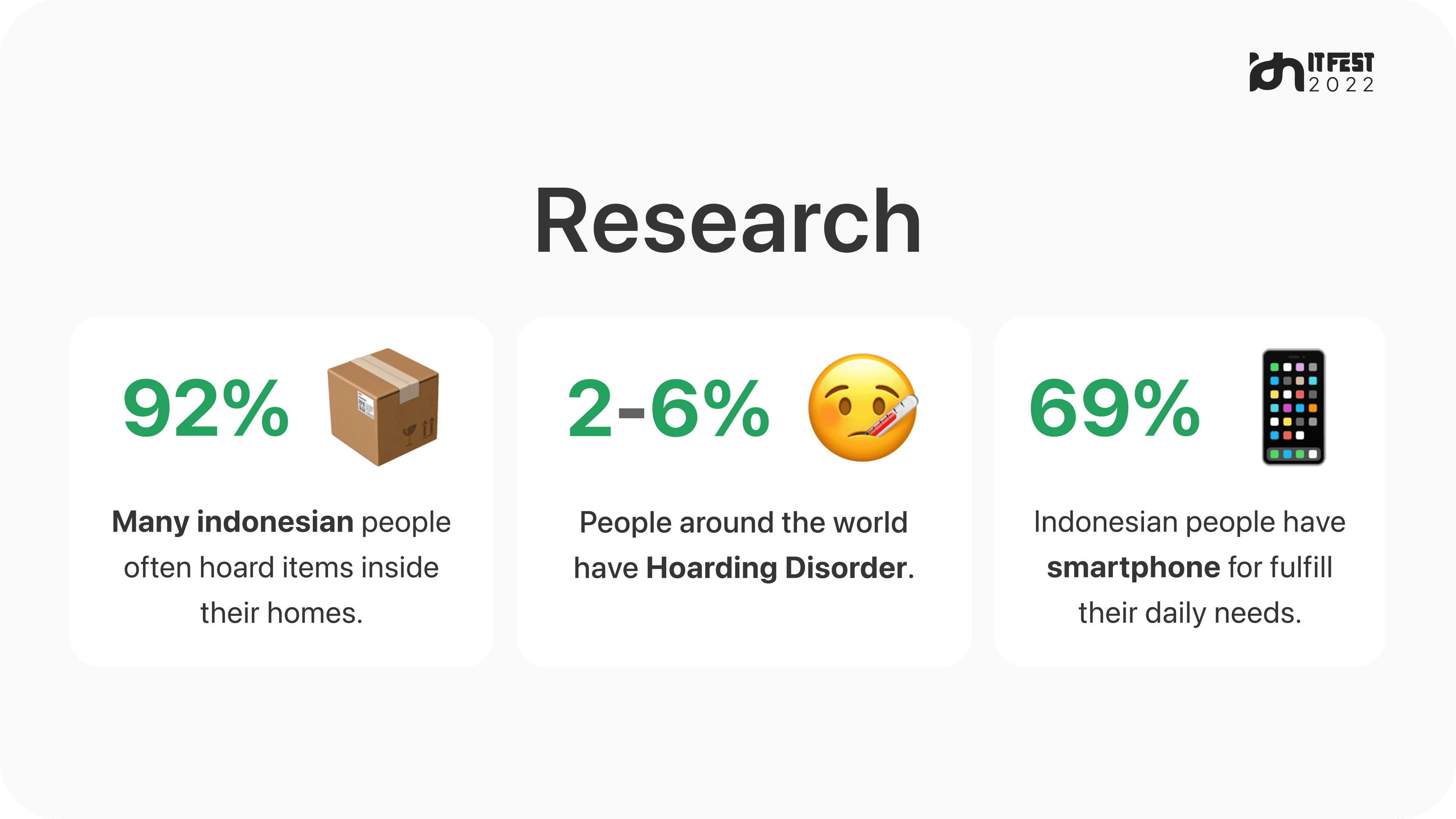
After conduct a research we interested with 3 insights that we get:
And we defined the problem to be focused on:
📦 Many Indonesian people often hoard items inside their homes.
Solution
Actually first, our ideas is inspired from an app named Kepul → where people can sell their hoard items. But because each of people have a different price, so we decided to add:
👉 Bid / Bargain Feature
Wireframes ⬜️
This is our first concept for sell item flow:
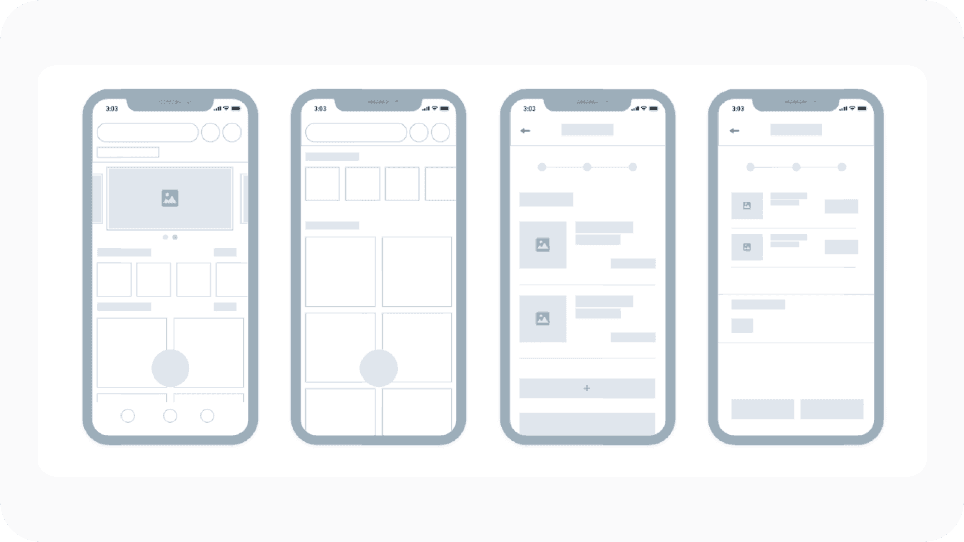
From Right to the Left: Home, Search result, Item & photo, item photo added.
Design Iteration 🔁
We conducted usability testing with our respondents, and based on their feedback, we implemented the following major modifications:
Resize the “Add Photo” Feature 👇
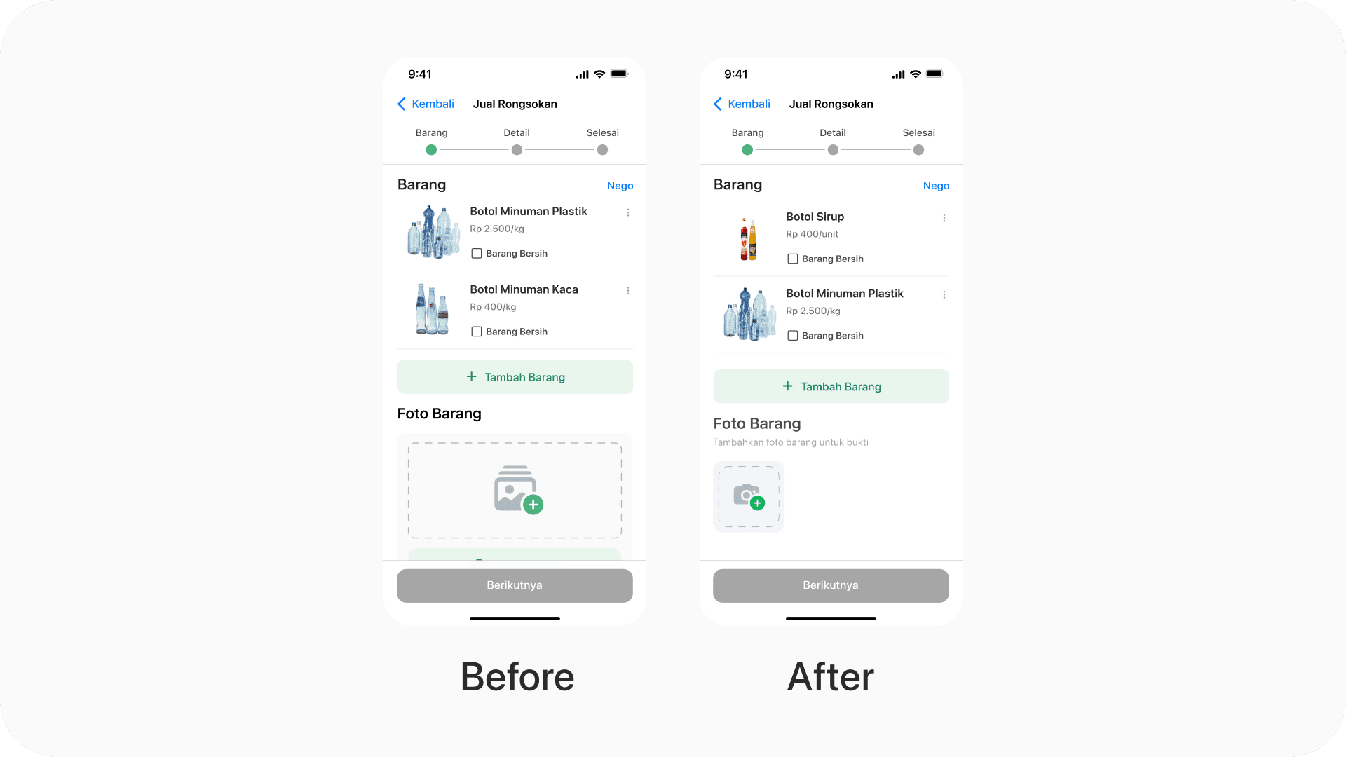
Before: The feature is too large, and we are confused about the design when the photo is added because it will be too large.
After: Resize the feature to make it more efficient and understandable for users.
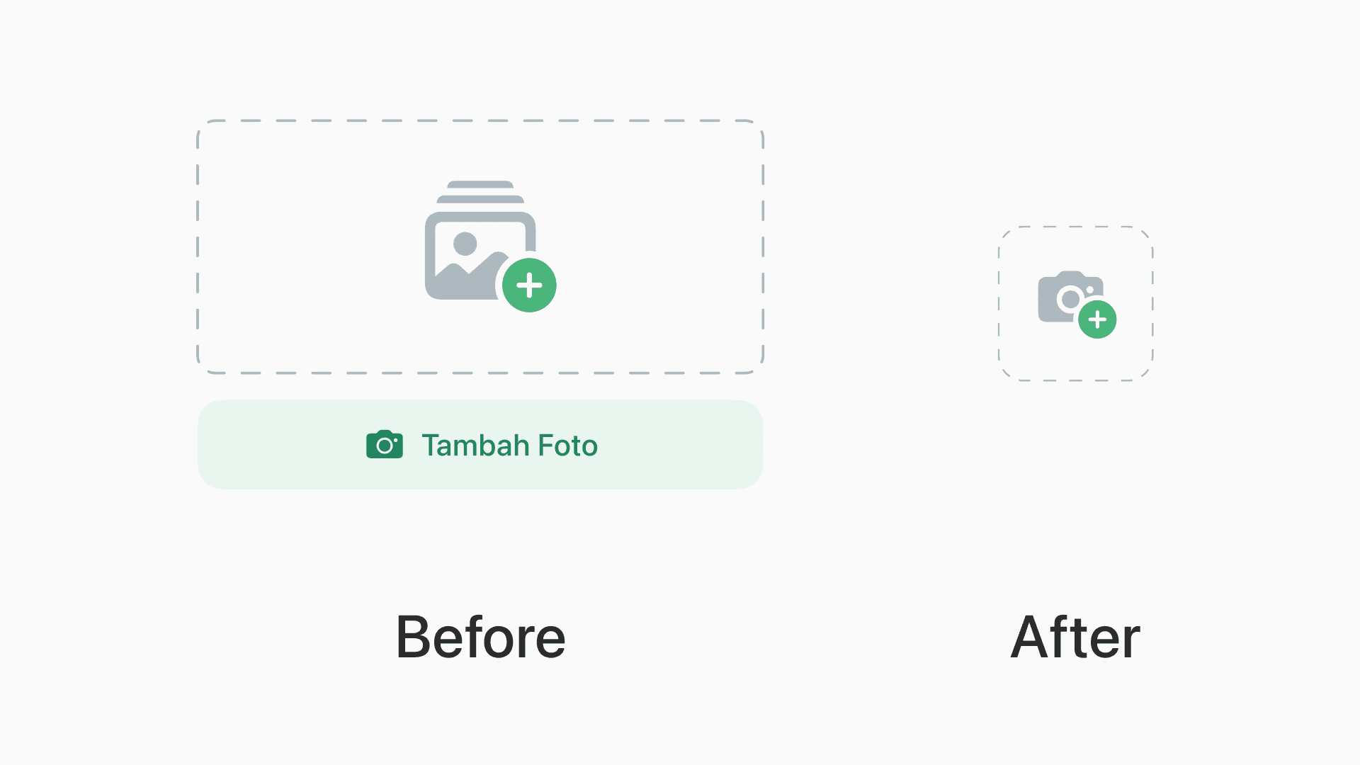
Design Iteration Detail.
Final Designs ✨
Sell and Bargaining - Flow 👇
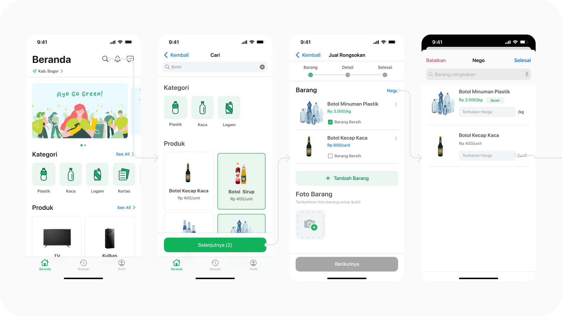
From Right to the Left: Home, Select item, Item page, Bargain page.
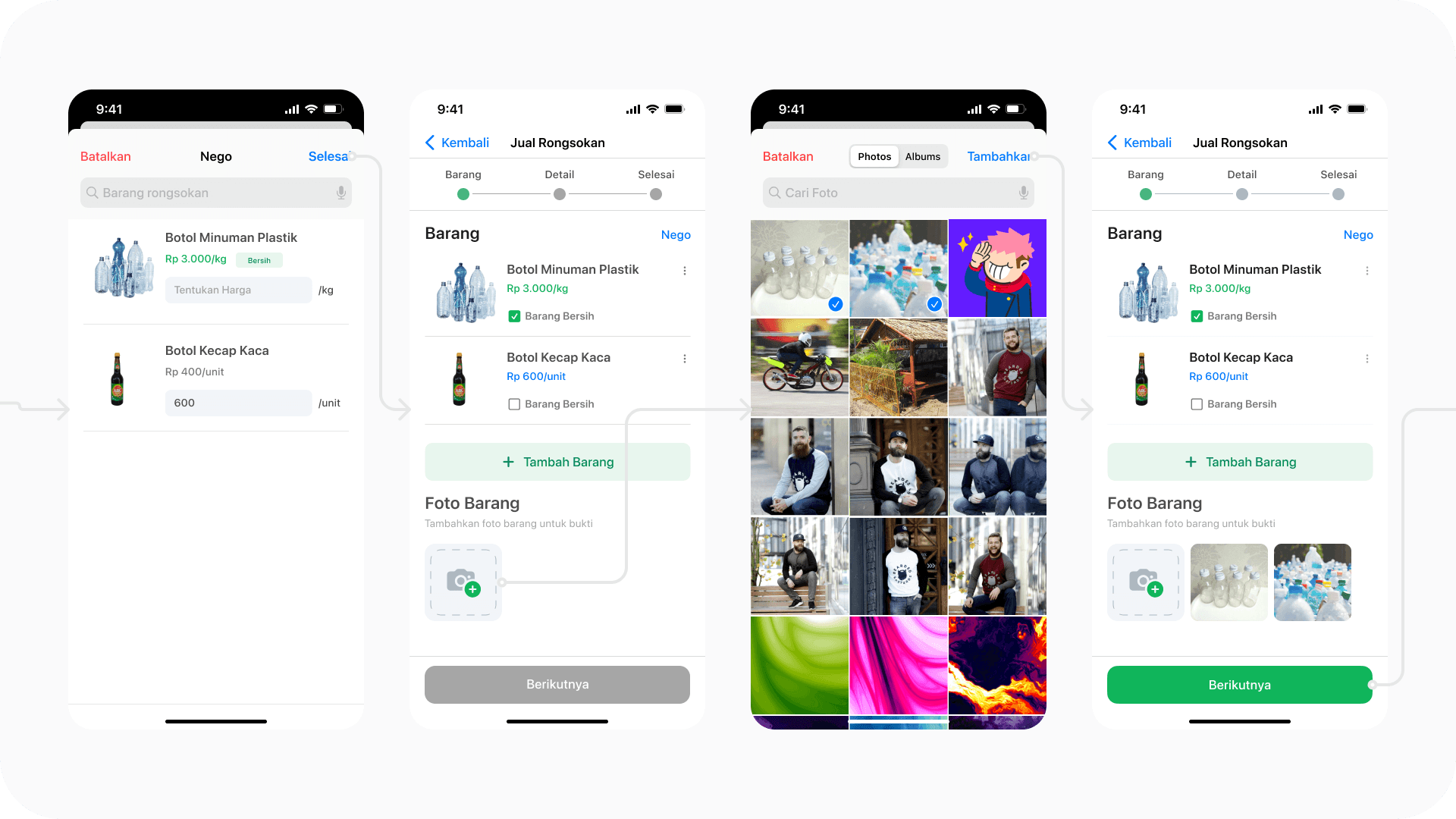
From Right to the Left: Input bid, Item page, Add photo, Item page (Photo added).
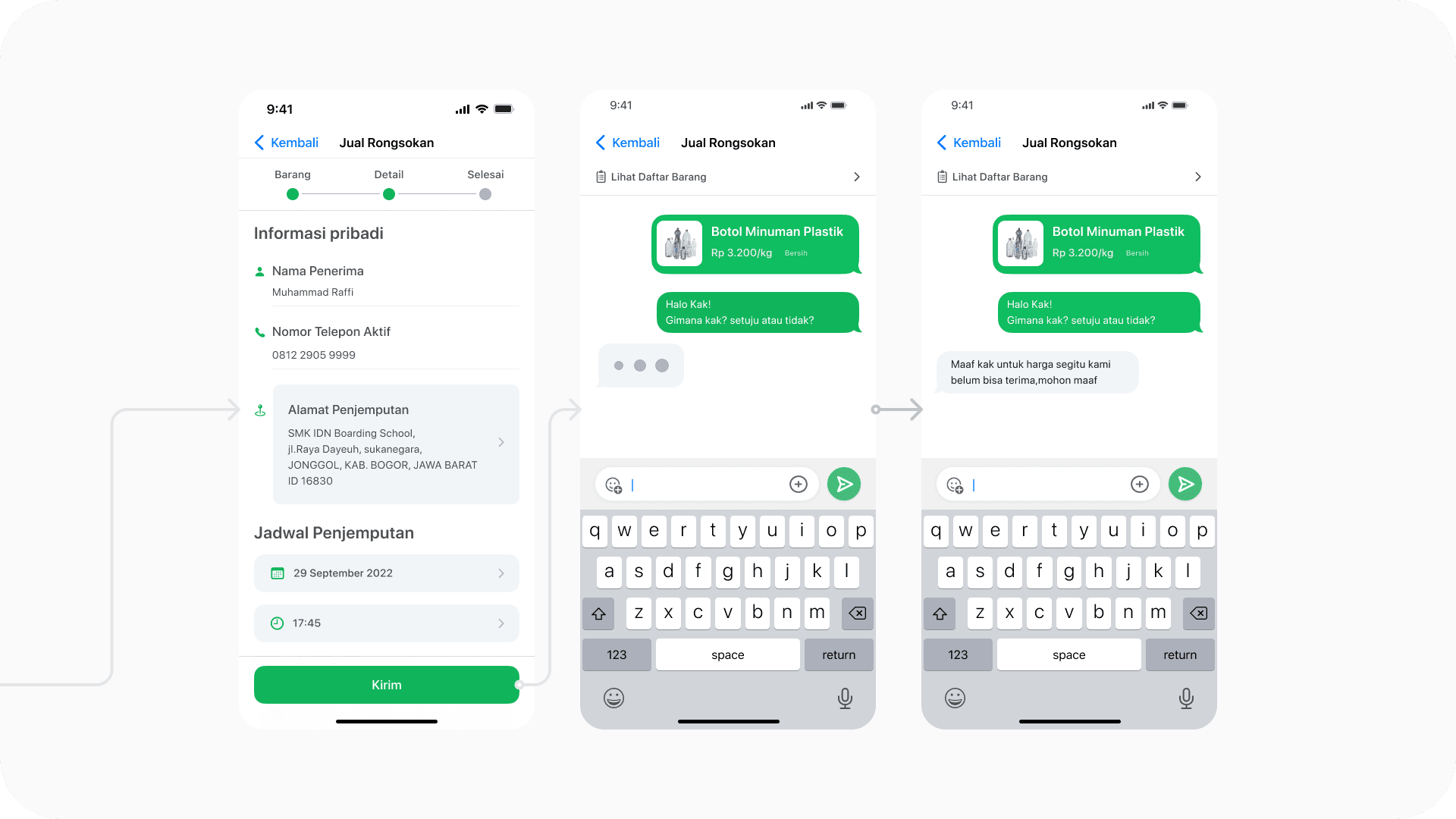
Prototype 📲
You can try it by yourself too, enjoy! 😄 Start Prototype Here
Documentation 📸:
After designing the tiny design system, we made the file more organized as it will be showcased during our school event (IDN Open House 2022).
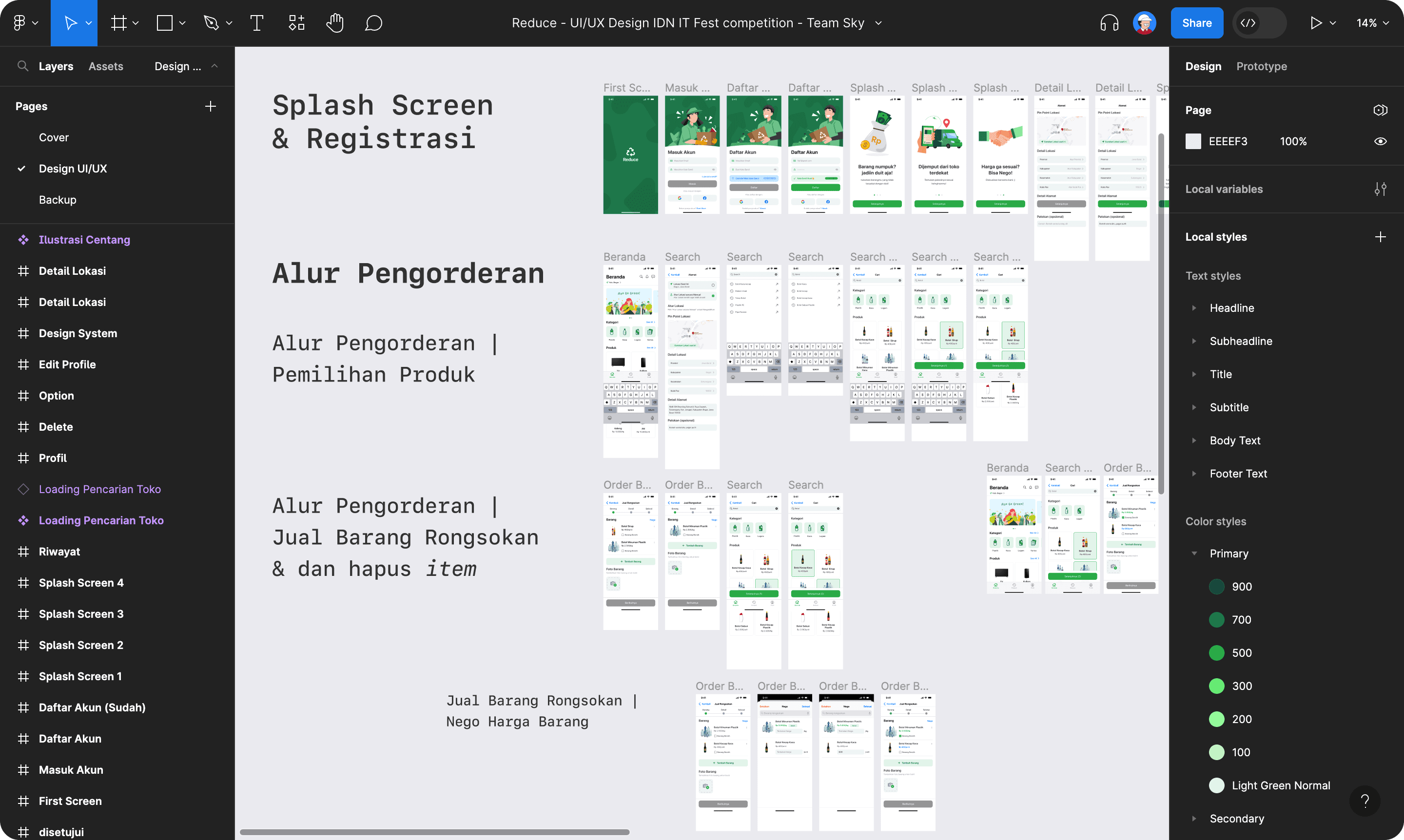
This is how we manage our design file.
Product Success 🌳
Alhamdulillah we get ranked the 1st place, after roughly 1 month of struggle, finally this is my first achievement to get the first place.
What I Learned 🌱
During this project, i learn a lot about and feel the team work, designing the UI design, also to make it pixel perfect ;)
🟢 Open for new Opportunities
If you are interested with my work, feel free to contact me. I am excited for collaboration and new opportunities. Thank you!
📨 iyadirviansyah@gmail.com → • 📝 CV/Resume → • 👨💻 LinkedIn →
© 2023 - Muhammad Iyad Irviansyah